Design
19 minute read
Content for Your Homepage: Tips and Best Practices.
LAST UPDATED:
February 19, 2024


The homepage is the first thing people see when they visit a website, so it’s important to make a good first impression with your homepage content.
Your homepage content will compel visitors to go deeper into your website. It should appeal to your target demographic—people who are interested in your services or products—and convert them into leads and ultimately customers.
It also helps you establish your authority in your niche. Your homepage is crucial in your overall sales enablement effort.
Good homepage web design helps to create a professional image and can be the difference between a visitor staying on your site or leaving quickly.
It’s important to learn that what your homepage offers is your most valuable asset, but it can be a nerve-wracking task to build one, especially when you don’t know where to start.
The trick is to spend time creating important elements throughout your homepage that provide people clarity on what you have to offer and how they can benefit from it.
The logo is the first element your visitors will see on your website’s homepage headline. Here are some important tips on how to create an effective logo and use it to your advantage:
Make it Eye-Catching:
Your logo is a way to brand yourself and your company. A well-designed logo can help to build brand awareness and accelerate quality lead generation.
Hire an experienced designer to create one that instantly attracts attention and inspires visitors.
Use Optimal Placement:
The most common spot for a logo is the upper left corner of the page. This is where people tend to look first.
Keep it Simple:
When it comes to graphic design, less is often more. A minimalist approach can help to create a clean and sophisticated look that will make your logo pop.
You want to make your logo pop without containing too many distracting elements. A minimalist design goes a long way.

Choose the Right Size:
A bigger logo doesn’t necessarily create a better impression for your brand. In fact, this can even lead to visitors losing interest.
Avoid Animation:
It can be tempting to animate your logo when you have the tools available. This negatively impacts user experience with the unnecessary visual noise.
If you’ve ever been lost on a website or unable to even locate the menu icon, then you know what we’re talking about.
Here are some ways to ensure that your visitors will be able to navigate your website easily:
Achieve Consistency:
The navigation menu should be located at the top of the page, and all of the important pages should be listed in it.
Use a logical layout for all important features. This helps people know what to expect and leads them to where exactly they want to go.
After all, you want your potential customers to be able to find all of the other pages of your website!
Include Lean Options:
The more options you have, the more confusing it is for visitors. A website with too many features can be difficult to navigate and even cause decision fatigue.
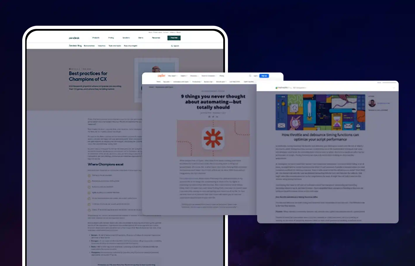
Describe Each Tab:
Use on-point labels that reflect the exact service you’re offering. Instead of simply using “Services,” assign a specific name to avoid vague descriptions.
Use the Hamburger Icon:
This standard icon with the three horizontal lines is not only recognizable but also enhances site navigation and helps users quickly navigate your website. Place the word “Menu” beside it so it’s easier to locate.
Provide Access to Your Blog:
Lead magnets are an essential part of any inbound marketing strategy. They give users a reason to opt in to your site or blog, and they help you earn their trust by providing valuable information.
You may have noticed the large image on a homepage that captures your attention. This is what you call the “hero shot,” or your website’s main photo. Here are some ways to use it effectively:
Let the Hero Image Represent Your Brand:
Because the hero shot is the biggest photo on your homepage, it should tell visitors what your brand is all about. The image should be able to explain right away how they can benefit from your products or services.
Aim for Coherence:
Make sure that the hero shot you choose will blend well with your brand. An image that has little connection to your vision and values cannot inspire interaction.
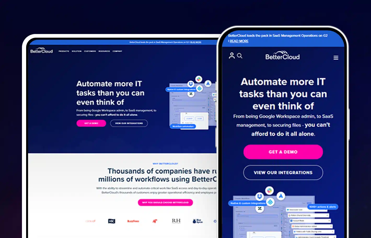
Keep it Straightforward:
Make it simple, make it fit, and make it your brand! The photo should encapsulate the hero message of your brand.
Make it Meaningful:
A well-thought-out image helps highlight your company values. Choose an authentic shot relevant to your brand rather than a stock photo that appears fake.
Ever heard of the term WIFM? It stands for, “What’s in it for me?” And, this is exactly what people have in mind the first time they see your homepage content. To create a clear-value proposition statement in a few words, remember the following points:
Make Your Brand the Answer:
People are always looking for value, and this is what they should get the first time they visit your website. You must let them know that you have something that can benefit them a great deal.
Tie it with Your Hero Shot:
Place your tagline near the main image. Make sure the text properly exemplifies what the photo is portraying.
Provide a Clear Message:
Be clear about how you can help. This text must explain what you do and highlight the key points of your brand offering.
Your website’s written content should include a clear description of your product’s benefits to the customer, and also briefly touch on a few key features.
Make it Catchy:
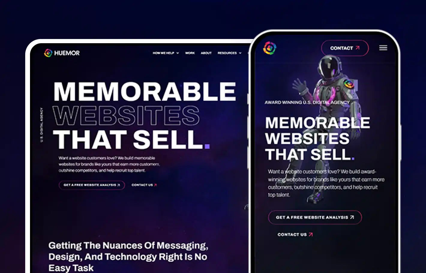
Your headline is what people read right away and associate with your business. A great example is Huemor’s “We Create Memorable Websites That Sell.”
Every homepage content needs a well-worded CTA or “call to action.” Here are some ways to make your CTA work for you:
Get Your Message Across:
An effective CTA creates a sense of need, an urgency that is hard to pass up. If your CTA can achieve this, you’re golden.
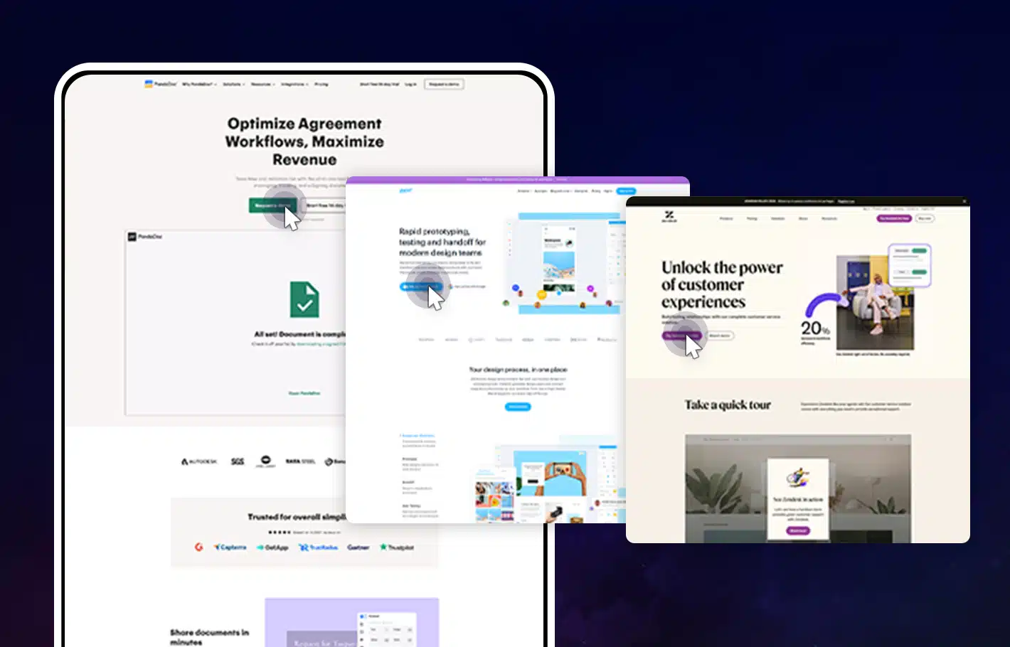
Use Command Verbs:
Always use action words to establish your point and encourage visitors on what to do.
Use the First-Person:
This perspective lets you take ownership of your brand. It also lends you a confident tone, which builds credibility.
Emphasize the Value:
Mention the value that your visitors will get when they click on your CTA button. This should be clear from the get-go.
Offer Free Tools:
Offering free resources is a great marketing strategy to increase brand awareness and build customer loyalty.
Give your visitors access to free materials like PDF downloads or ebook guides. Users will feel they’re getting great value and will be more likely to support your brand.
Build Your Subscription:
Encourage visitors to sign up and receive emails from your business. They may not be ready yet, but they certainly have great potential to become customers.
Whatever content strategy you choose, make sure it’s something that will appeal to your target audience and give them a reason to sign up for your emails.
With a little effort, you can quickly build up a list of potential customers who are interested in hearing from you on a regular basis.
More Proof?
Your visitors will need convincing success indicators that your product or service is the one they’re looking for.
This is where your proof building will come in handy for your homepage content:
Publish Social Proof:
Make positive statements from people who believe in your brand. The use of success stories and well-formatted testimonials help elevate your status in your chosen field or niche.
Use Statistics:
Numbers provide evidence of how well your product or service is doing. They offer a preview of your brand’s capacity to help.
Provide Images:
Photos are another way to prove how much your brand is making a difference. They confirm how wide your reach is in terms of location and groups of people.
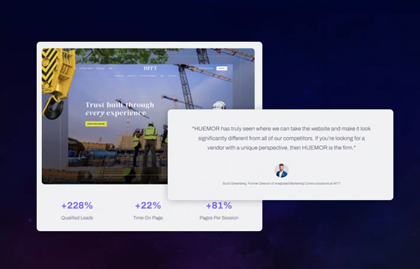
When it comes to designing a website, content is king. The content on a website should be well-written and accurate, providing visitors with the information they need.
Content is an essential part of a successful online marketing strategy. It is what draws people to your site and keeps them coming back for more. There are many factors to consider when crafting content, such as your audience, your message, and your goals.
Here are some content marketing tips and ideas for your website that will help you stand out from the rest.
Your blog is a direct route for convincing visitors that your product or service can be a huge game-changer for them. Here are ways to make blogging work for your brand:
1. Write for Your Audience
Before you start writing, it’s important to consider who your target audience is.
Who are you trying to reach with your content? What kind of information do they need? What would interest them?
By understanding your audience, you can create content that resonates with them and speaks to their needs.
2. Communicate Your Message
Second, think about what message you want to communicate with your content.
What do you want people to know about your brand? What are your core values?
By aligning your content with your brand message, you can ensure that people will remember what they read on your site.
3. Choose the Right Goals
Keep your goals in mind. What do you hope to achieve with your website?
Whether it’s increasing sales or growing awareness for your brand, make sure that all of your content supports your larger objectives.
The Difference Between B2C and B2B Website Homepage Content
Homepage content needs to be well-written, easy to read, relevant, and appealing. But what kind of content should you include on your homepage?
That depends on whether you’re running a B2B or B2C website.
B2B Homepage Content
B2B websites are designed for business-to-business transactions. They typically target other businesses, rather than individual consumers.
As a result, B2B homepages need to be geared towards business users. The content should be professional and focused on the benefits of doing business with the company.
It’s important to always use updated content that includes clear calls to action and easy ways for businesses to get in touch.
Some homepage content ideas for B2B websites include:
- A brief overview of the company and its services
- A list of the company’s key differentiators
- A call to action to learn more about the company’s offerings
- Testimonials from satisfied clients
- A contact form or live chat option for businesses to get in touch
B2C Homepage Content
B2C websites, on the other hand, are designed for business-to-consumer transactions. They target individual consumers who are looking to purchase products or services.
As such, B2C homepages need to be more consumer-oriented. The content should be catchy and attention-grabbing, with a strong focus on the company’s products or services.
It’s also important to include easy-to-use features like customer reviews and product galleries.
Some homepage content ideas for B2C websites include:
- A welcome message from the company’s CEO or founder
- A summary of the company’s mission and values
- An overview of the company’s products or services
- Customer reviews and testimonials
- A gallery of product images or videos
- A blog featuring lifestyle articles or guides related to the company’s products or services.
As a part of your content marketing roadmap, your blog is a direct route for convincing visitors that your product or service can be a huge game-changer for them.
Here are ways to make blogging work for your brand:
Write Engaging Posts:
According to content marketers, if you want to encourage visitors to read your content, write interesting articles.
Use attention-grabbing titles and a story format that’s easy to follow. A blog can be a great way to share your expert tips with the world.
Make Articles Easy to Find:
If your blog posts are out of sight from the navigation bar, it will be hard to convince visitors of the value you can give them.
Use a Grid Format:
A gridlike setup offers a clean design for your blog, thus making articles easy to access. Feature posts with catchy featured images with descriptions.
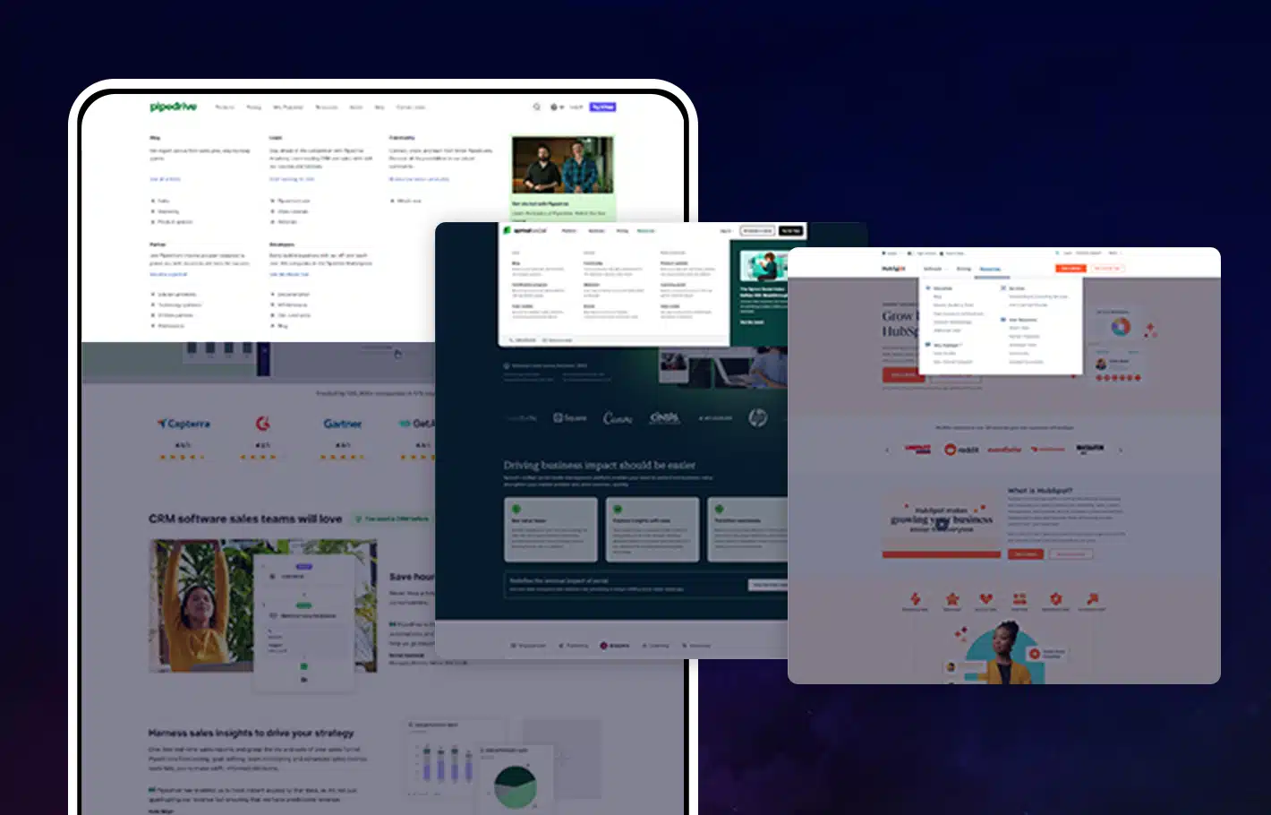
Provide a Teaser:
Include a section for your blog that highlights top posts or recent articles on your homepage. But, only give a preview and not too much information!
Don’t Forget Your CTA:
Use a “Read More!” CTA to ensure that visitors will end up clicking the link to your posts after reading the previews.
Your homepage content should be SEO-friendly, meaning the keywords you use for all content are optimized and will show up on a standard search. Here are ways to win this technical game:
Do Your Research:
You can’t simply write content and expect people to quickly find your site on the first search. Use keywords that rank the highest and use them for your homepage.

Know Where to Put Your Keywords:
Place keywords strategically in your title, headline, menu, alternative text for images, as well as your meta descriptions.
Avoid Overstuffing:
Using keywords more than the recommended number of times can be counterproductive. You can use the right search engine optimization tools to build a searchable homepage.
Google Analytics can be a valuable tool for evaluating the effectiveness of your website’s SEO strategy.
The footer requires an awesome design, yet it is one of the most overlooked parts of a homepage as the footer is a key element of your website homepage content.
The footer is just as important as any other aspect because it contains the following elements:
Contact Information:
This includes your company’s mobile and landline numbers.
Location:
This provides your registered business address and physical branches if applicable.
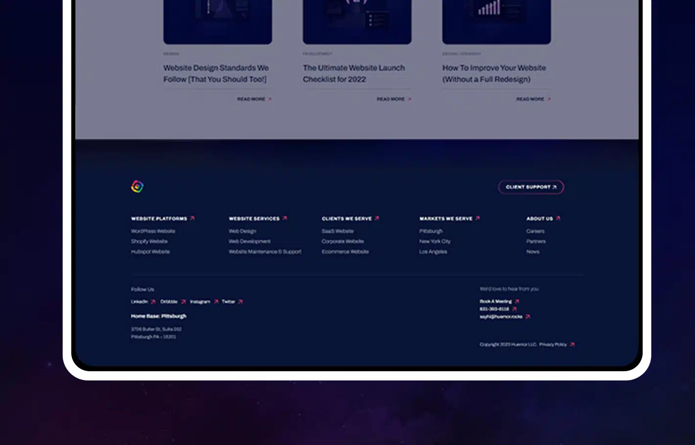
Social Media Platforms:
These links will lead them to your company’s official Instagram, Facebook, Twitter, Pinterest accounts, and more.
Resources:
If your company is partnered up with other platforms or organizations, this is where you encourage visitors to visit other related sites.
Email Sign-Up:
This is a perfect way to build your mailing list and generate leads.
Final Call to Action or CTA:
This is where you find the “Contact Us” link to invite people to send you a message and request more information or schedule a call to talk to someone from your team.
Check out our blog post on footer design for more information!
When it comes to content for a homepage, there is a lot of debate about what the true purpose should be.
Some believe that the content should be designed to sell a product or service, while others believe that it should be informative and help a website visitor understand what the company is all about.
However, the reality is that both of these approaches have their own advantages and disadvantages.
If the content on a homepage is solely focused on selling a product or service, then it runs the risk of coming across as pushy or sales-oriented. This can often turn potential customers away, as they may feel like they are being bombarded with information about a product or service that they are not interested in.
On the other hand, if the content is purely informational, then it may fail to capture the attention of potential customers and persuade them to stay on the site long enough to learn more about what the company has to offer.
The best approach is usually to strike a balance between the two approaches. The content on the homepage should be informative and give potential customers an overview of what the company does, but it should also include some call-to-action elements that encourage visitors to stay on the site and learn more.
Your website homepage content is your ticket to creating a positive impression of your brand to your future customers. That’s why it’s important to spend time and effort building an effective one. Think of it as an investment. Do your research, hire a professional, and look for great examples of homepages that will inspire you to build your own.
Most importantly, always keep your target audience and customer in mind and the way they want to access information on your homepage. Your best bet is to navigate your website from the perspective of visitors and see how well it ranks with engagement and ease of use.
For more helpful articles on how to use digital marketing to promote your brand, check out our other posts!
Here are some best practices and further info on creating content for homepage, web development and website design in general. If you have further questions, don’t hesitate to reach out.
Homepage Content Creation FAQ
Questions about how to create content for your homepage? We try to answer them here.
What content should a homepage have?
A homepage is the first page of a website. It should provide an overview of the website’s purpose, as well as links to the most important or popular pages.
The homepage should be designed in a way that makes it easy for visitors to find what they’re looking for. This may involve including a search bar, featured content, contact information, a value proposition statement, and clear navigation.
The layout and style of the homepage should be consistent with the rest of the website. This will create a more cohesive experience for users and help them to understand the website’s hierarchy.
Ultimately, the goal of a successful homepage is to offer social proof and give visitors a snapshot of what the website has to offer and help them to find the information they need.
How do I put content on my homepage?
Your homepage is the face of your website. It’s the first thing that visitors see when they arrive, so it’s important to make a good impression. There are a few different ways to add content to your homepage. One option is to use a homepage template. Homepage templates usually include a selection of pre-designed content blocks that you can add to your page. Another option is to create a custom homepage. This gives you more control over the layout and design of your homepage, but it requires more knowledge of HTML and web design.
It’s important to make sure that your homepage contains information that is both relevant and engaging. One way to do this is to include a brief introduction or welcome message. This can be a simple greeting or a more detailed explanation of what your website is all about. You should also include links to some of your most popular pages or articles. This will give visitors an idea of the type of content that they can expect to find on your site. Finally, you may also want to include a few featured images or videos. These can help to break up the text and add visual interest to your homepage. With a little thought and effort, you can create a homepage that is both informative and inviting.
Whether you have a Shopify store, a WooCommerce website, or are on a different ecommerce platform, these tips apply equally.
What are the 5 most important things for a website?
A website is a digital space that represents you or your business online. It’s important to make sure your site includes the following five elements:
- A clear and concise message. You want visitors to know what your website is about as soon as they land on it. Make sure your site’s tagline, header, and other key elements communicate what you do or sell in a few words.
- Engaging content. Once you’ve grabbed their attention, you need to give visitors something compelling to read, watch, or listen to. Content should be well-written, accurate, and engaging. Include images, videos, and infographics to break up text and Keep people scrolling.
- Calls to action. Your content should guide visitors toward a desired goal, whether that’s signing up for your email list, buying a product, or scheduling a consultation. Include clear calls to action (CTAs) throughout your site to make it easy for people to take the next step.
- Easy navigation. People should be able to find what they’re looking for on your website quickly and easily. Use clear and concise language in your menus and headers, and include a search bar if your site has a lot of content.5
- Optimized for mobile. More people than ever are accessing the internet from their smartphones, so it’s important to make sure your website looks great and works well on mobile devices. If you’re not sure how your site stacks up, run it through Google’s Mobile-Friendly Test tool. These days, there’s no excuse for having a website that’s not optimized for mobile users.
What are some of the best homepage websites?
In today’s day and age, a strong online presence is essential for businesses of all sizes. That’s why having a well-designed website is so important. The homepage is often the first thing that potential customers will see, so it’s crucial to make a good impression. With that in mind, here are some of the best websites around when it comes to homepage design. Each of the homepage websites listed above provides unique and valuable content to their respective audiences.
- Whitehouse.gov.: an excellent source of information for updates on the U.S. government and current events.
- Cobb Pediatric Therapy Services: provides resources and information on pediatric therapy services and treatments.
- Jill Konrath: offers sales advice and strategies for entrepreneurs and businesses.
- Boxbee: provides storage solutions for small spaces.
- AirBnB: simple and modern, AirBnB’s homepage immediately draws visitors in with its striking imagery and clear call-to-action buttons.
- Amazon: one of the most popular websites in the world, Amazon keeps its homepage clean and simple, with easy access to the company’s vast array of products and services.
- Apple: like many tech giants, Apple puts its latest products and services front and center on its homepage. However, what sets Apple apart is its sleek and sophisticated design aesthetic.
- Orbit Media Studios: great example of a well-designed homepage. The site uses a clean, minimalistic layout that makes it easy to find the information you’re looking for. The header contains links to the most important pages on the site, and the footer includes a contact form and social media icons.
- Tech News: another excellent example of a homepage website. The site features a news feed that contains the latest stories from the world of technology. You can also find links to articles, videos, and podcasts.
- Feldman Creative: from the mind of digital marketing consultant and genius Barry Feldman, this site is a great example of a simple, one-page layout that makes it easy to find the information you need.
- Dropbox: Dropbox keeps things clean and simple on its homepage, with a focus on providing potential customers with quick and easy access to the company’s cloud storage offerings.
- eBay: one of the largest e-commerce platforms in the world, eBay’s homepage is full of featured items and deals from sellers around the globe.
- Etsy: Etsy is a marketplace for handmade goods, vintage items, and craft supplies, and its homepage offers a curated selection of items for sale from a variety of independent sellers.
- Facebook: the social media giant put images front-and-center on its redesigned homepage back in 2011, and hasn’t looked back since.
- Google: the world’s largest search engine keeps things minimal on its iconic homepage, with just a search bar and a few helpful links.
- Instagram: a visual platform par excellence, Instagram’s website features a feed of popular photos and videos from users around the world.
- LinkedIn: LinkedIn is a professional networking site that helps people connect with job opportunities and business contacts. Its straightforward homepage makes it easy to find what you’re looking for.
- Mosseri Design Company: the home page of this web design agency definitely lives up to its name, featuring a beautiful mosaic-style layout that showcases some of the firm’s best work.
- New York Times: one of the most respected news sources in the world, The New York Times’ website features prominently placed articles alongside links to different sections of the paper.
- Twitter: Twitter keeps things simple on its homepage with a stream of recent tweets from people you follow.
Which is better, WooCommerce or Shopify?
When comparing WooCommerce vs Shopify, there is no clear winner. Each platform has pros and cons, and it comes down to what matters most to you and what you are trying to do with your store. Whether you have a B2B ecommerce website or a beauty brand, you’ll need to dig in deep to understand each ecommerce platform and what it offers. Our article comparing WooCommerce and Shopify is a good place to start.
Can you redesign my website, including the homepage?
Yes, website redesign is one of our primary specialties. No matter which ecommerce site you’re on, we can redesign your entire site, including the homepage, the about us page, checkout page, product pages, category pages, and blog.
Further Reading On Website Design and Development.
Looking for web development and design inspiration? These articles should help.
- How Much Does It Cost to Build a Website?
- A Step-by-Step Website Redesign Project Plan
- How to Build a Web Design System
- Our Approach to WordPress Web Design
- Choosing the Right Product Metrics Using UX Research Process
- Our Top Retail Website Examples
- Understanding Web Design vs Web Development
- Our Top Beauty Website Examples
- Our Shopify Speed Guide Checklist
- Guide to Optimizing Shopify Image sizes
- Our Service Page Layout Examples
- Best SaaS Websites of 2022
- Our Approach to HubSpot Website Design
- New Website SEO Foundations
- Our Approach to Startup Website Design and Development
- WordPress Performance Optimization Best Practices
- 100 Ecommerce Website Design Tips
- How to Use Dynamic Website Content
- All About SaaS Website Design
- How We Approach Drupal Website Design and Development
Get Memorable Insights.
Sign up to receive actionable web design advice directly in your inbox monthly.
Get Memorable Insights.
Sign up to receive actionable web design advice directly in your inbox monthly.
Author
Jeff Gapinski is the President of Huemor where he helps plan the long-term strategic growth of the agency. Jeff is passionate about UI/UX, demand generation, and digital strategy.
What Do You Think?
Have feedback? Maybe some questions? Whatever it is, we'd love to hear from you.


![Website Design Standards We Follow [That You Should Too!]](https://huemordev.b-cdn.net/wp-content/uploads/2021/12/2023.04.04.Website-Design-Standards-We-Follow-That-You-Should-Too.jpg.webp)



No comments found