Conversion Optimization
19 minute read
How to Optimize Your Checkout Page Design.
LAST UPDATED:
January 29, 2024


It doesn’t matter how well your product page converts. If your checkout page design is leaky, you don’t make money.
Lots of companies waste thousands of dollars trying to optimize their ecommerce website but leave glaring errors on their checkout page.
(And this means they’re losing tens of thousands in profit.)
In this ultimate guide to checkout design, you’ll learn how to redesign and optimize your checkout page to improve user experience, reduce cart abandonment, get more customers, and increase your ecommerce store’s revenue.
You’ll also see some awesome checkout page examples along the way.

You have to understand why people decide to buy before you can encourage them to buy more.
In this chapter, you’ll learn what triggers buying behavior and see some inspirational checkout designs from ecommerce brands that are doing a great job encouraging shoppers to buy.
By the end, you should have a better understanding of how to use web design to create checkout pages that encourage positive buying behavior.
The Fogg Behavior Model
There’s a Stanford professor named B.J. Fogg who studies decision making.
He condensed his findings into the Fogg Behavior Model.
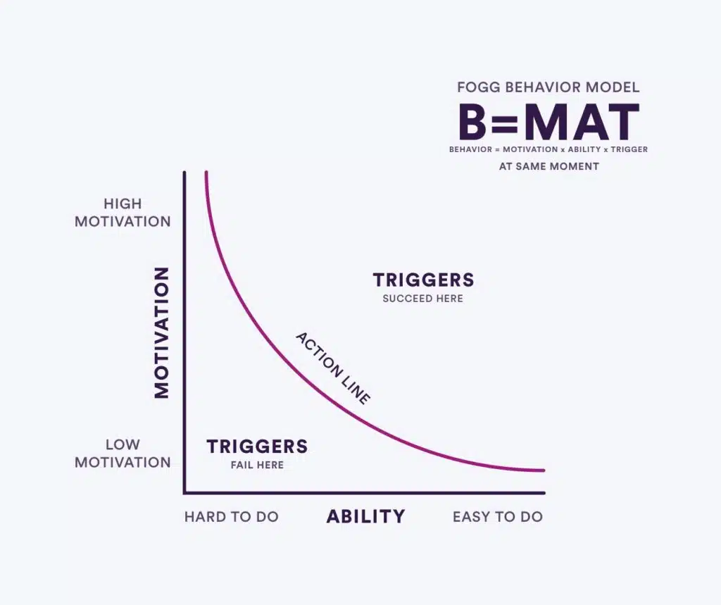
Let’s use this model to explain how people progress through the checkout flow.
The Fogg Behavior Model is B=MAT. Behavior happens when motivation and ability are high enough that triggers fire.

Motivation: How much does a person want to do this?

Ability: How feasible is this? Will this require a lot of time or effort?

Trigger: The jolt that, when motivation and ability are high enough, spurs someone to take action.
Activities with high motivation but that are time-consuming or hard typically lead to inaction.
Likewise, activities that are easy to do (that have high ability) but are not very motivating lead to frustration and boredom.
Most importantly, triggers—like getting an email about a product you expressed interest in—fail when either motivation or ability is low.

Hearing/seeing an Ad

Opening an Email

Social Media
Here’s the deal.
If people aren’t interested, no amount of good marketing or copywriting will make them interested.
But the people who do still have that kernel of desire can be turned into buyers.
Here’s how.
Fogg and Ecommerce
Let’s look at the ecommerce buyer’s journey and how we can improve conversion rates.
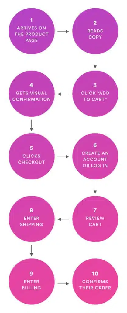
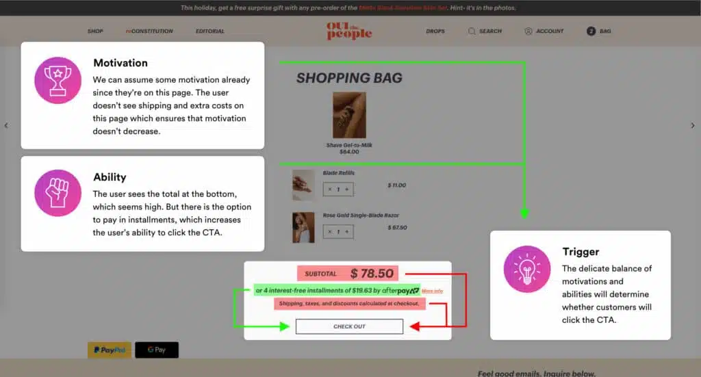
First, someone loads your product page. You can assume they have some motivation to buy your product—they’re looking at it.
There are plenty of reasons a shopper might drop off here. Most of them get traced back to motivation or ability.
Motivation: They’re not interested in what it does, it doesn’t seem like it solves a problem, or the benefits aren’t clear enough.
Ability: It costs too much, it’s too big/small, or they have doubts about how happy they’d be with the purchase.
The trigger is the “Add to Cart” button.
Sometimes there are other motivating factors:
- Free shipping cost on orders over $<dollar amount>
- Delivery before <an important date> (if you buy within the next <small number of> hours), or
- Seeing that somebody else just bought a similar product in real-time
We’ve talked plenty about how to improve your product page design.
Assuming the trigger fires, they’d added the product to their cart. Congratulations!
Now the next step: getting them to checkout.
Let’s follow the model again.
Does this start to make sense? Let us know in the comments if something is still unclear.
According to Baymard research, 69.57% of shoppers abandon their cart.
It might seem silly, but sometimes people don’t know if your website actually added the product to their cart.
So they add it again…
Or they get confused…
Either way, you’re not making their lives easier.
In this chapter, you’ll learn how to optimize the “Add to Cart” checkout experience.
Show a clear confirmation
The best way to improve the add to cart checkout experience is to use animations as checkout progress indicators.
But which animations?
We’ve seen a few UI design techniques work:
- Animate the cart
- Animate the “add to cart” button
- Prominently display a confirmation message either on the cart or beneath the CTA
Let’s look at each.
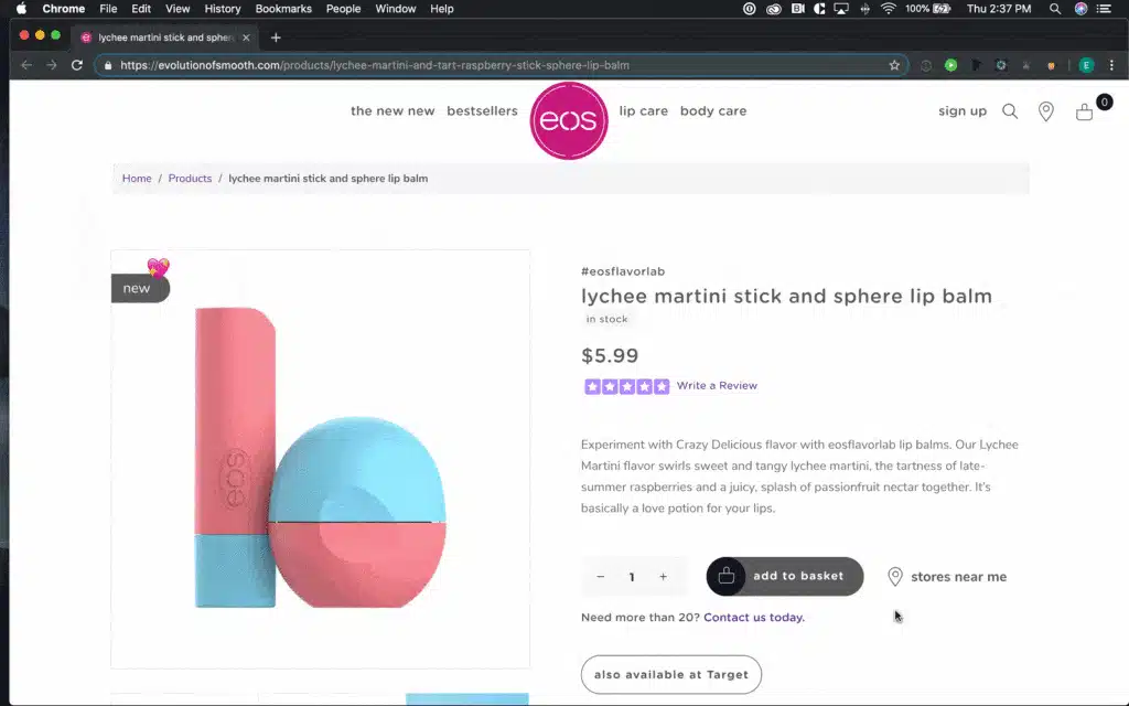
Cart Animations
Use an animation to show shoppers their cart contents instead of loading a new page.
People often check what’s in their cart before they add more to it. This keeps them on your product page as they do that.
CTA Animations
Encourage shoppers to click the Add to Cart button (i.e., increase their ability) with a small animation.
Confirmation Messages
Provide positive feedback when someone adds an item to their cart.
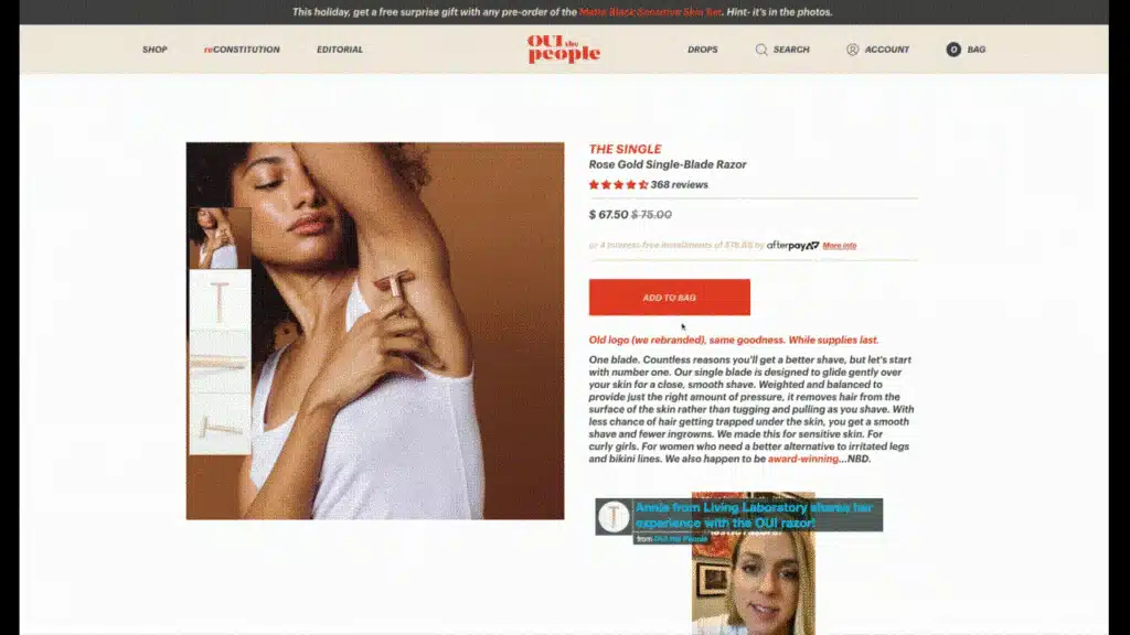
In this example, Oui Shave uses an animation to show the cart contents.
But this isn’t the only way. For an effective checkout, you could also show a notification over the cart icon and jostle it to achieve the same effect.
Keep Your Store Fast
People don’t like to wait for anything these days.
Page loads are no exception to that.
Where you can, remove the requirement for someone to load a cart page to view their products. Instead, opt for an ajax side cart instead.
Also, make sure you follow website speed optimization best practices. Keep images small, compress your code, and lazy load content when possible.
What happens next?
That depends on your goal.
In order to avoid checkout abandonment, you should always show them the cart contents.
From there, you have 2 choices.
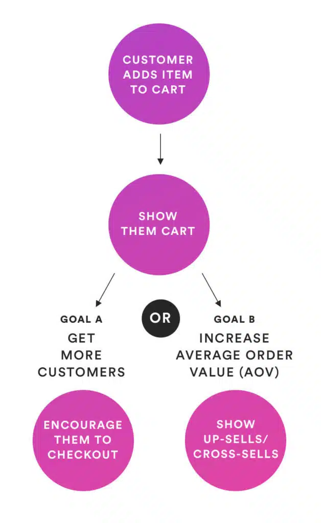
Goal A: Get More First-Time Customers
Encourage this person to checkout as soon as possible. Once they’ve made the switch from shopper to buyer, they’re more likely to buy again.
Goal B: Increase Average Order Value
This is best if you have a steady number of returning shoppers who checkout with small carts.
Show them up-sells and cross-sells to encourage them to check out with a larger cart value.
The next important step is to display the cart contents.
There should be no doubt in your shopper’s mind about what’s in their cart or how much it’s going to cost. Surprise costs are, after all, a huge trigger for people to abandon their cart.
(Yes, B=MAT works for that too!)
Similarly, it should allow users to easily change quantities or delete items from their cart entirely.
In this chapter, you’ll learn how to create a stellar cart experience.
Design for Clarity
The things you need to show on the cart page are:
- Products in cart
- Quantity of each product
- Cost of each product + of multiples
- Shipping + Fees
- Total Cost
Let’s briefly look at each.
Products In Cart
Obviously, you need to show your customers what’s in their shopping cart.
Include everything.
Even the free products.
Quantity of Each Product
You should show how much of each product is in the cart.
If there’s none of a product, don’t show it.
If there are 2 of the product, show that there are 2.
Cost Per Product
Even if someone has 2 of a certain product, you should still display the per-item cost.
And then show the quantity and the total cost for that item.
Like $19.99 x 2 = $39.98.
Shipping and Fees
You do NOT want to hide these costs until the payment information.
Instead, show them up front.
That said, extra costs will lower your shopper’s motivation and ability to complete their order.
You need to do whatever you can to offset that. (Offer free shipping above a certain threshold, include tax and fees in the item price, etc.)
Total Cost
Surprise costs lead to abandoned carts!
You need to tell shoppers exactly how much they’re going to pay to checkout BEFORE they hit ‘checkout’ and go to your checkout page.
Cart Control
Don’t force people to confirm their changes with a “change” button.
Instead, simply accept the modifications they make.
If they delete an item or change the quality to 0, your store should save that change in their cart.
The Visual Hierarchy: Lead them to Checkout
Your number 1 action should be to continue to checkout.
The “Checkout” button on your Cart page or pop-out should be prominent.
Use a bold color and white space to create contrast (which makes it stand out).
Away Travel does this well:

The “Check Out” button in a different color from the rest of the page, has plenty of white space surrounding it, and is bold.
The Coupon Conundrum
Coupons are a great way to lower the barrier for first-time purchases (and therefore increase their ability to become your customer.). They’re also a great way to strengthen your relationship with existing customers.
But coupon forms can drive away (discount-seeking) customers who don’t have a coupon.
The solution?
Back in 2009, Jakob Nielsen suggested embedding coupons in links from emails. When a shopper clicks on the link, that coupon gets automatically applied.
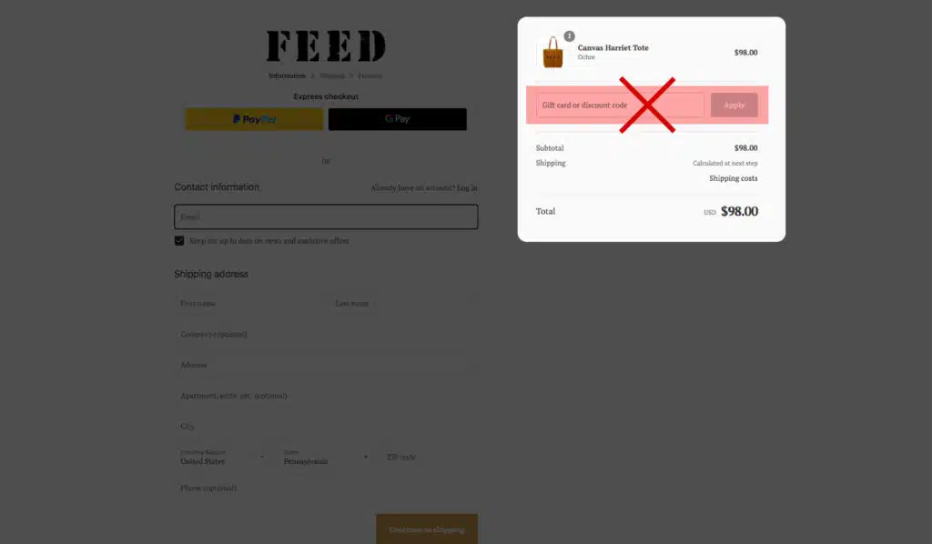
Remove the coupon code from your checkout form.
Persist Cart Contents
Not everybody is going to buy the first time they visit your website.
But if someone adds an item to their cart, leaves your online store, comes back and finds the item isn’t in their cart anymore…?
You wouldn’t go looking for it either, would you?
This is the ecommerce equivalent of your computer crashing and eating your unsaved work. It’s frustrating! And given the choice, most people would walk away.
In this case, the design principle of “persistence” should be applied. This means that the contents of a shopper’s cart should be maintained even if they leave the site and come back later.
Account creation is a major drop-off point for shoppers.
In fact, 31% of shoppers abandon their cart due to forced registration.
But registration is still important to your business; customers who create an account have a smoother checkout page flow in the future.
In this chapter, you’ll learn how to display trust to get the best of both worlds: customers who create accounts and a lower purchase abandonment rate.
Keep reading.
DO NOT FORCE REGISTRATIONS
It bears repeating.
Seriously, stop doing this.

Here’s what you should do instead:
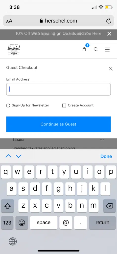
1. Always Offer A Guest Checkout
Enable guest checkout without making them create an account.
The language you use here has an impact. Don’t force people to choose between “login” and “register.” Make them choose between “returning customer” and “new customer.”
Even better: assume they don’t have an account but give them the option to log in on the checkout page.
2. Skip The Login Screen
Similar to the previous tip.
It’s a waste of time to direct users to a login page if they don’t have an account.
Instead, offer the choice between “returning customer” and “new customer” and only send the returning customers to the login page. New customers get an express checkout experience.
3. Ask For An Email First On The Checkout Page
The first thing you should do for new customers is to ask for their email.
Why?
Because now, even if they don’t checkout, you can still send them marketing emails. In other words, you can send them reminders to checkout. You can also check email address before sending your promotional emails to ensure accurate communication and increase the likelihood of reaching your target effectively.
4. Offer Account Creation On The ‘Thank You/Confirmation’ Page
Now that a customer has confirmed their order, it’s time to prompt them to make an account.
Why?
Well, for one, what else is there to do?
But more importantly: they already did the big thing. They made their purchase. They’ve converted from “shopper” to “buyer.”
Buyers have accounts.
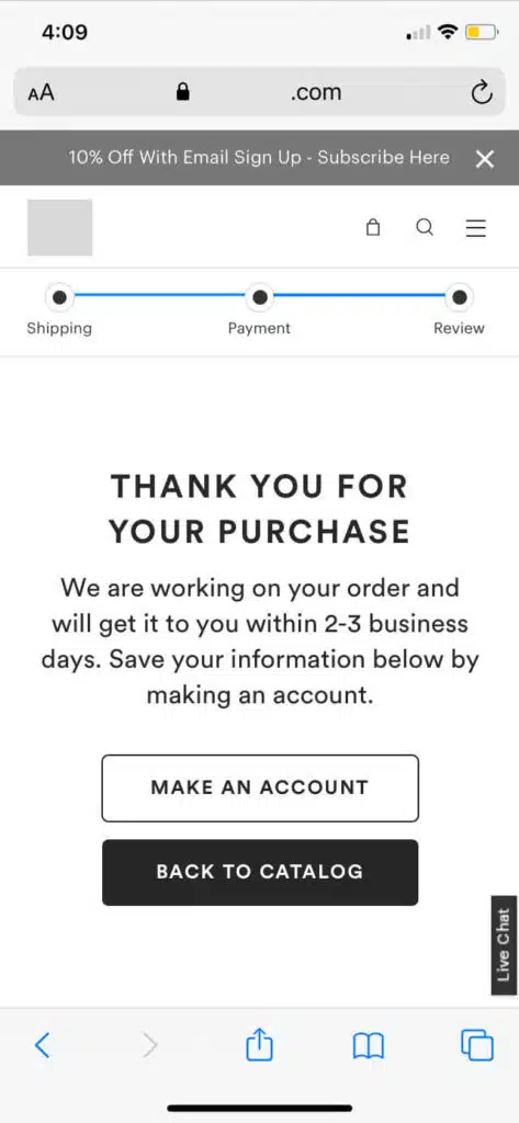
5. Offer An Increntive For Making An Account
The end of the process is the perfect time to offer someone an incentive to create an account.
They just completed their purchase. They’re on your confirmation/thank you page.
This is the perfect opportunity to set up the next purchase. Offer a discount or free shipping on their next purchase. Offer to throw in something free (or add a freebie) to their current purchase…if they create an account.
Even with everything you did above, if your checkout page design is too intimidating, then people will take the opportunity to bail.
And all the work you’ve done will be a waste.
Fortunately, we can use psychological research and checkout page best practices to reduce the chances of that happening as much as possible.
Keep reading for the details—and for examples of checkout pages that implement these best practices.
Ask for Billing Information Last on the Checkout Page
Make a small ask before a big ask.
The people who comply with the small ask are more likely to also comply with the big ask. (This is called the foot-in-the-door technique.)
What’s the most demanding ask on your checkout form?
It’s billing information—they have to find their wallet, pull out their card, and punch in a bunch of different numbers. That requires a lot more commitment than typing their name.
Protip
Rank your form fields from “easiest” or “hardest” and reorder your checkout page accordingly.
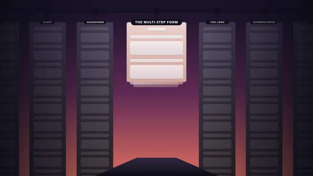
Use Multi-Step Forms
For some people, even seeing the “hard” questions will cause them to jump ship. You can mitigate this with good form designs.
For others, it’s an issue for form length. Seeing the entirety of what they need to fill out is too intimidating—or is an excuse for them to bail.
But you can sidestep this concern entirely if you use multi-step forms.
Use Skeuomorphic Payment Forms (Make Your Payment Form Look Like a Card)
You can make your payment forms even less intimidating if you structure them to look like a credit card checkout.
This is a helpful visual aid for your customers: the card number on the field tells them where to look on their card.
It removes a step—even if it’s a small one.
Here’s an example one of our designers mocked up. Feel free to use it as a jumping-off point.

Make Your Payment Look Secure on the Checkout Page
People are on guard against credit card information theft.
If your payment gateway doesn’t look secure, you’ll trigger that guard.
(In Fogg’s terms, you’ll kill their motivation to continue with checkout.)
How do you make your payment field look secure?
Create Visual Salience
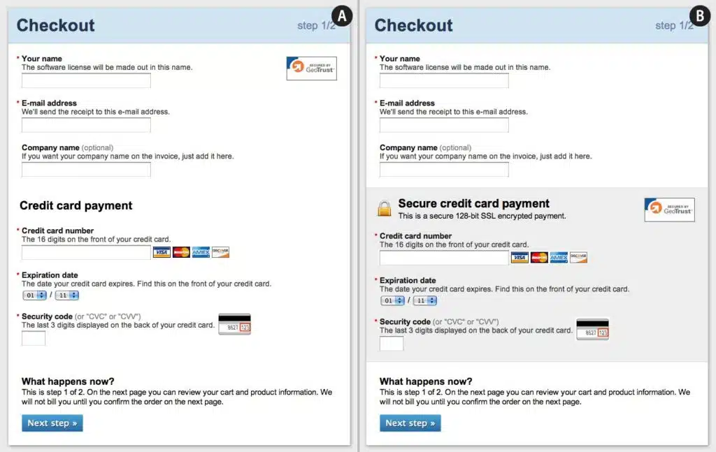
Baymard mocked up 2 versions of a payment form. The first one (A) has no difference between the payment options and the other information. The second one calls out the payment form specifically.
Obviously, the second one isn’t more secure than the first—visual design has no effect on how secure that transaction is. But it feels more secure to your customer.
The takeaway? Emphasize payment methods such as credit card info with graphic design.
Squash Visual Bugs On the Checkout Page
Especially during the checkout process—if something looks fishy, people will think it is.
Don’t let cosmetic errors ruin your chance at a sale.
Store Cards in Your System
For returning customers—make their checkout page shopping experience painless by storing their shipping and billing information in your system.
This dramatically reduces the number of clicks and actions they need to make.
(This means you’ve increased their ability to complete the checkout process!)
If you can only do this for shoppers with an account, you can pitch this as part of the account creation ask.
Responsive web design is imperative in today’s mobile-first world. But, you’ll need to pay special attention to how your checkout page performs on mobile.
Mobile has its own unique set of challenges when getting people to checkout.
For one, mobile users are much more likely to bail.
Forms are also harder to fill out because of the extra clicks they require.
In this chapter, you’ll learn how to create a mobile checkout interface design that converts.
Shopping Cart Best Practices
The biggest obstacles on mobile come down to loading times.
This is because mobile devices have less processing power than desktops. Less processing power means more of a delay between the click and the action.
If you make people click a lot, you’re making them wait a lot.
Give Cart Add Feedback
Just like on desktop, make it unambiguous when someone adds a product to their cart.
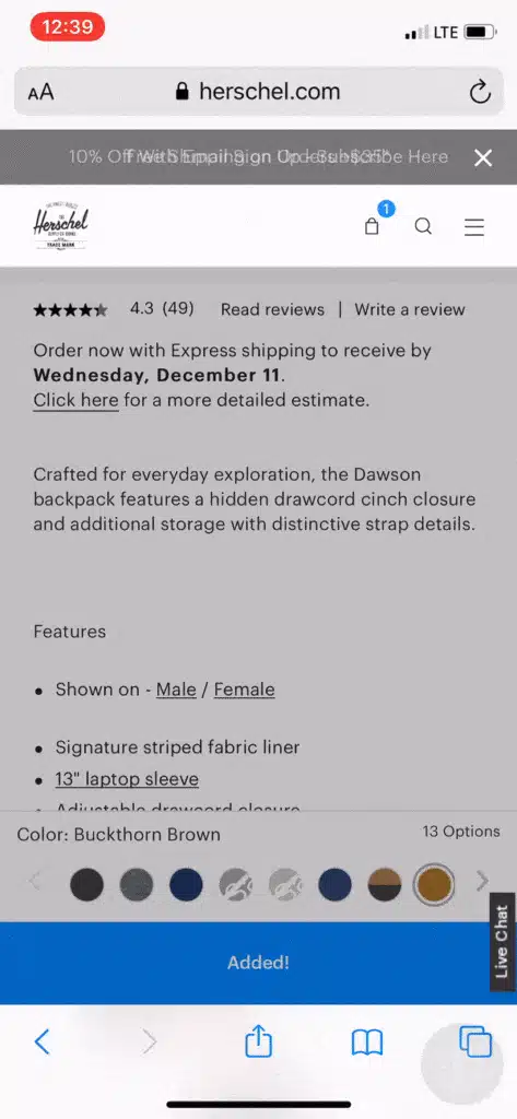
Here, Herschel does 2 noteworthy things:
- They display a model that confirms to the shopper that they added the product to their cart
- They change the CTA text to confirm that the shopper added the product to the cart
These are small UX improvements that go a long way, especially on mobile.
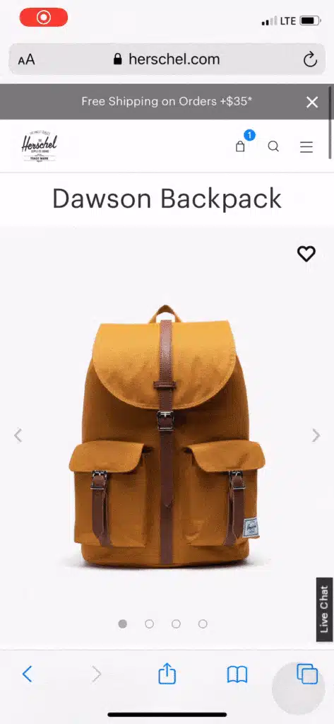
Provide Quick Access to the Shopping Cart
Don’t make your customers load a new page to see their shopping cart.
Drop-downs or slide-outs are even more important to use on mobile.
Herschel does a good job with theirs.
Make it Easy to Update Cart Contents
If shoppers have to struggle to update their cart contents, you risk alienating them altogether.
Don’t refresh the page.
Don’t make them use an “Update” button to commit their changes.
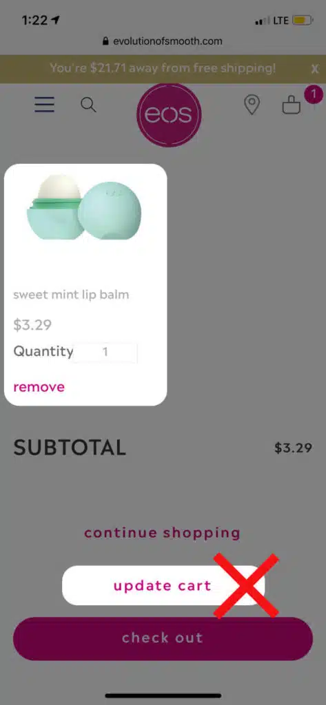
Implement a ‘remove’ button next to each item that uses AJAX to change their cart contents (and therefore doesn’t force the page to refresh).
(Here, in EOS’s case, we’re not sure what happens if we click “remove” but not “update cart”—does the product actually get removed?)
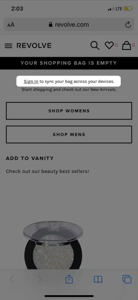
Support the Ability to Switch Devices
Some people will shop on their phone but wait until they get to a computer to actually checkout.
Apple has the fantastic handoff feature. But Android users don’t have access to that.
Instead, you should offer people the chance to sign in to sync their shopping across devices.
Form Fields & Input Best Practices
Present the correct keyboard
When your customers go to type in their credit card number and you present them with a standard keyboard.
If someone is typing in a numerical field (credit card information, phone number, etc.), give them a number page.
Likewise, use the special email keyword for the email field.
Pre-fill fields based on previous inputs (for returning customers)
If someone has an account with you, you should save their information and pre-fill the form for the next time they checkout.
This makes subsequent purchases even more seamless. It reduces clicks (always a bonus on mobile) and lowers the effort they need to expend to finish the checkout process.
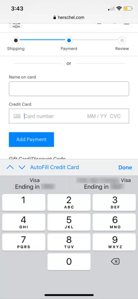
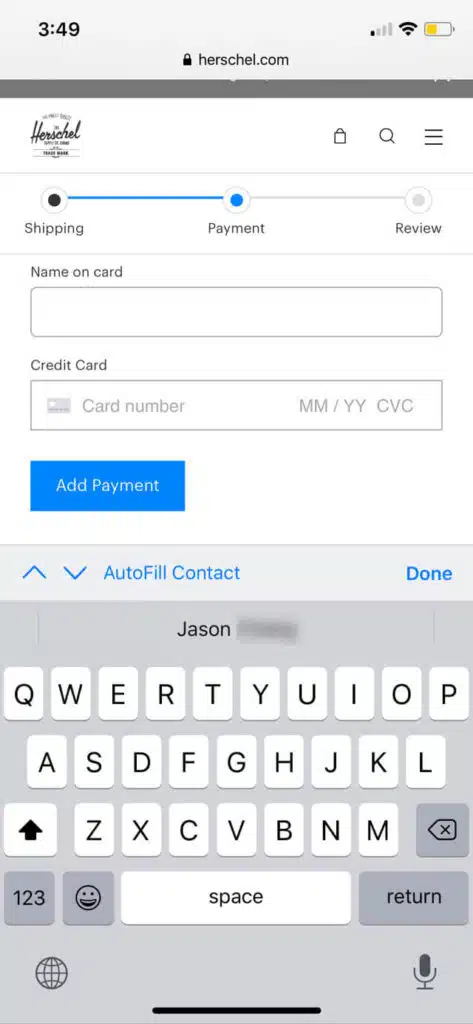
Use browser autofill for name, address, email, phone, password, and credit card information
Make sure your store is compatible with Safari and Chrome browser autofill.
Why?
Because browser autofill saves shoppers a LOT of time and effort (increases their ability to complete the checkout process). Requiring customers to complete unnecessary steps is just bad design.
Eschew long drop-downs for State and Payment expiration date
Long drop-downs aren’t good for mobile users.
They require excessive scrolling and it often takes longer than simply typing.
Let your shoppers type in these fields.
Mobile Payment
Don’t Overwhelm Shoppers With Too Many Payment Choices
We know that choice is demotivating.
We also know that when you force someone to make a choice, you’re diluting some of their mental power.
Take a look at what Vineyard Vines does:
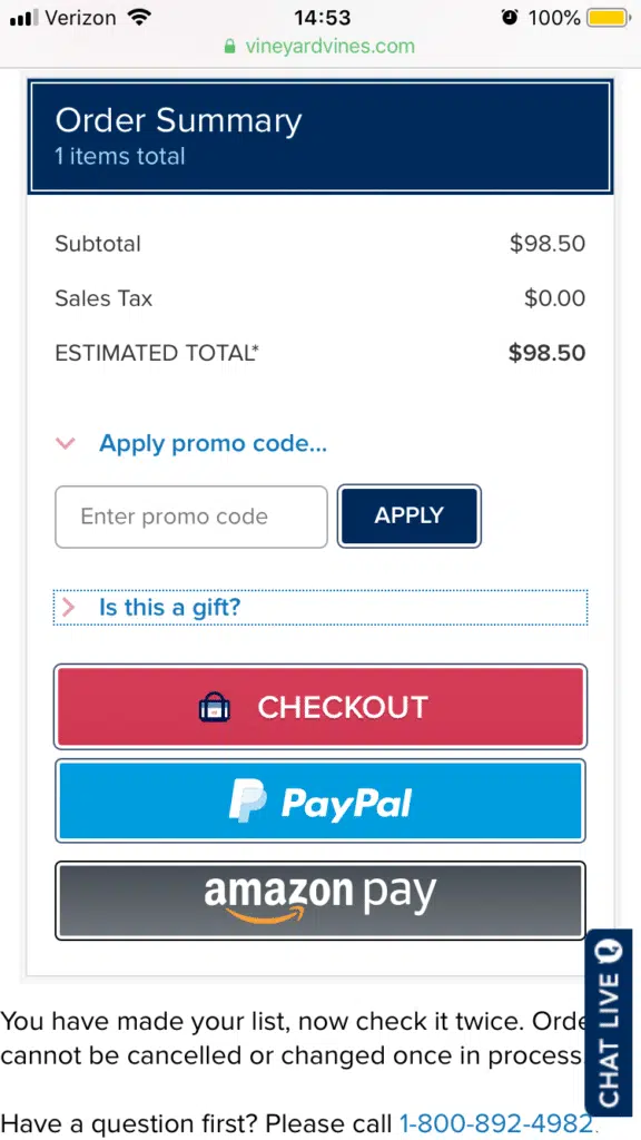
They have THREE different checkout CTAs.
Don’t do this. Have a single CTA (Checkout) and then give people the option to select how they’d like to pay.
Use Apple (And Google) Pay
Apple Pay lets Apple users check out quickly. Google Pay does the same for Android users. It removes the toughest step: entering credit card information.
Fortunately, both Shopify and WooCommerce have built-in Apple-and-Google Pay capabilities.
You just need to activate it on your settings.
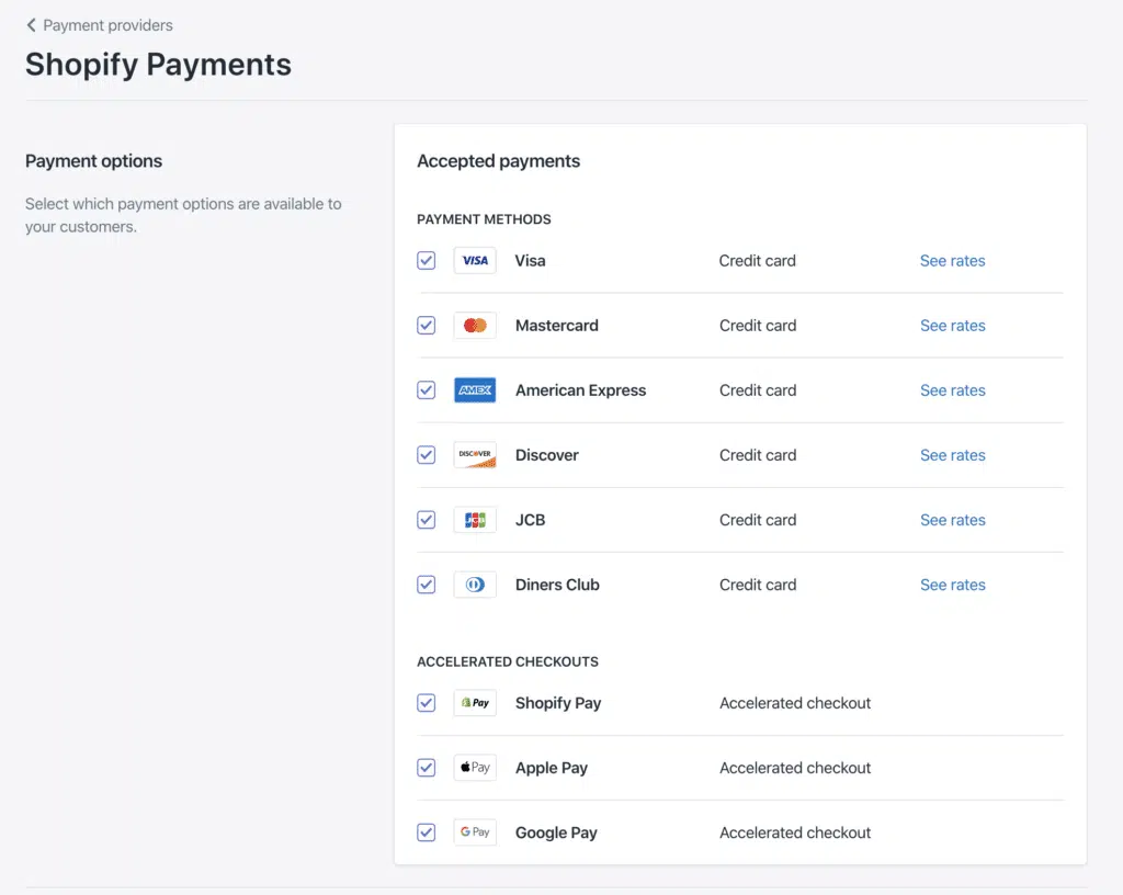
This is low-hanging fruit but it’s easy to overlook. Double check!
It may be easy to ignore your checkout page if it’s not a glaringly bad design. However, it’s important not to sleep on the opportunity to improve it; you could add tons of revenue to your business.
Do you feel ready to supercharge your checkout process? We’d love to know how it turns out.
Have any additional questions for us?
Write a comment below and we’ll get back to you.
Here are some best practices and further info on checkout page design, web development and website design in general. If you have further questions, don’t hesitate to reach out.
Checkout Page Design FAQ
Questions about how to optimize your checkout page? We try to answer them here.
How do I make a good checkout page?
A checkout page is a critical part of any ecommerce website. It’s the final step in the purchase process, and it’s where customers enter their payment information.
As a result, it’s important to make sure that your checkout page is designed with both usability and security in mind.
Here are a few tips to help you create a checkout page that’s both easy to use and secure:
- Use a well-known payment processor: customers are more likely to trust a checkout page that uses a familiar payment processor like PayPal or Stripe.
- Include clear instructions: make sure your checkout page includes clear instructions on how to complete the purchase. If there are multiple steps, consider using numbered or bullet points to list them out.
- Offer customer support: include contact information on your checkout page in case customers have any questions or problems. This can help to build trust and reduce abandoned purchases.
Following these tips can help you create a checkout page that’s both user-friendly and secure.
What is a good checkout page?
A checkout page is the final step in the process of making an online purchase. It is the page where the customer enters their shipping information and payment information.
A good checkout page is easy to use and understand. The fields should be clearly labeled, and the page should provide instructions on how to complete the checkout process.
In addition, a good checkout page will have a number of security features to protect the customer’s information. These may include encryption, fraud detection, and data protection.
Whether you have a Shopify store, a WooCommerce website, or are on a different ecommerce platform, these tips apply equally.
By taking these measures, a company can ensure that their checkout page is safe and secure for all customers.
When designing a checkout page, what do you think is the most important aspect?
There are a few key factors to keep in mind when designing a checkout page.
First and foremost, the page should be easy to navigate and understand. Customers should be able to see all of the relevant information at a glance, without having to hunt for it.
The checkout process should also be streamlined and simple, with as few steps as possible. The page should be secure, to ensure that customers’ personal and financial information is safe.
Finally, the checkout page should provide customer support options in case there are any problems with the purchase.
What is an ecommerce checkout?
Ecommerce checkout refers to the final step in an online purchase, where the customer enters their payment information and completes the purchase. The checkout page is typically the last page in the online checkout process, and it is usually where customers enter their credit card or other payment information.
This typically involves completing a checkout page with your shipping and payment information. Once the checkout process is complete, the order is typically processed and shipped by the merchant.
Ecommerce checkout pages can vary greatly in terms of their design and functionality. Some stores may have a simple checkout page with only a few fields to fill out, while others may have multiple steps and options for customization.
The ecommerce checkout page is sometimes called the “cart page” or the “order page.”
The checkout process is important because it confirms the customer’s order and ensures that all of their information is correct. It also provides an opportunity for the customer to review their order and make changes before they finalize it.
Which is better, WooCommerce or Shopify?
When comparing WooCommerce vs Shopify, there is no clear winner. Each platform has pros and cons, and it comes down to what matters most to you and what you are trying to do with your store. Whether you have a B2B ecommerce website or a beauty brand, you’ll need to dig in deep to understand each ecommerce platform and what it offers. Our article comparing WooCommerce and Shopify is a good place to start.
Can you redesign my website, including the checkout page?
Yes, website redesign is one of our primary specialties. No matter which ecommerce site you’re on, we can redesign your entire site, including the about us page, checkout page, product pages, category pages, and blog.
FREE ANALYSIS
Request Your FREE Website Analysis
Further Reading On Website Design and Development.
Looking for web development and design inspiration? These articles should help.
- How Much Does It Cost to Build a Website?
- A Step-by-Step Website Redesign Project Plan
- How to Build a Web Design System
- Our Approach to WordPress Web Design
- Choosing the Right Product Metrics Using UX Research Process
- Our Top Retail Website Examples
- Understanding Web Design vs Web Development
- Our Top Beauty Website Examples
- Our Shopify Speed Guide Checklist
- Guide to Optimizing Shopify Image sizes
- Our Service Page Layout Examples
- Best SaaS Websites of 2022
- Our Approach to HubSpot Website Design
- New Website SEO Foundations
- Our Approach to Startup Website Design and Development
- WordPress Performance Optimization Best Practices
- 100 Ecommerce Website Design Tips
- How to Use Dynamic Website Content
- All About SaaS Website Design
- How We Approach Drupal Website Design and Development
Get Memorable Insights.
Sign up to receive actionable web design advice directly in your inbox monthly.
Get Memorable Insights.
Sign up to receive actionable web design advice directly in your inbox monthly.

Jeff Gapinski
President of Huemor
Jeff Gapinski is the President of Huemor where he helps plan the long-term strategic growth of the agency. Jeff is passionate about UI/UX, demand generation, and digital strategy.
What Do You Think?
Have feedback? Maybe some questions? Whatever it is, we'd love to hear from you.
Leave a Comment
![Website Design Standards We Follow [That You Should Too!]](https://huemordev.b-cdn.net/wp-content/uploads/2021/12/2023.04.04.Website-Design-Standards-We-Follow-That-You-Should-Too.jpg.webp)

No comments found