Design
9 minute read
Our 23 Top Retail Websites and Why We Love Them.
LAST UPDATED:
August 15, 2023


A retail website is an online platform maintained by a retailer to sell goods and services to a particular target audience. However, having one set up doesn’t automatically mean that retailers can immediately haul in customers and earn profits.
Web design is crucial when creating an effective retail website. A good retail website is all about accessibility, responsiveness, and the use of high-quality media, such as images and videos. A retail website should provide the best experience to users so they can convert into customers.
We’ve compiled a list of the best retail websites today to help you craft yours. Our company has long been creating websites for businesses worldwide, and the retail websites below meet our criteria for user experience, high-quality content, optimization for mobile use, and accessibility.
1. Allbirds
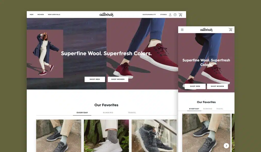
Allbirds’ website makes it to our list because the tone of their platform is friendly, easily builds trust, and encourages users to buy from them. Their shopping cart gives customers features free shipping to their customers. Their website design is simple yet effective. It draws the eyes to the unique images present on every webpage and allows for user interaction and user experience.
Even first-time users won’t have any problems using the website because it’s easy to navigate and the webpages highlight various products!
2. Swallowtail Tea
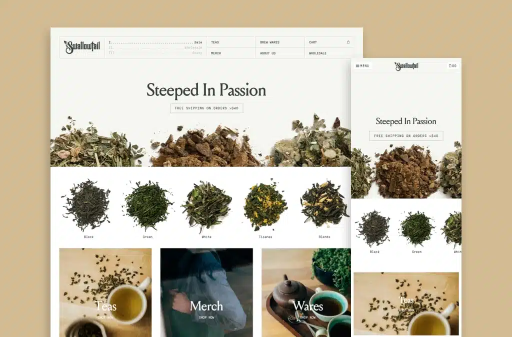
Users will be encouraged to buy tea from Swallowtail Tea’s website because it uses a very clean design that goes well with the calming effects of tea. Although the website’s design is subtle, any information a user might want is available, from a list of on-sale items and the company’s About Us page to various teas and merchandise.
The product photography is on point! Each of the product images highlights the product in their online store.
3. Glossier
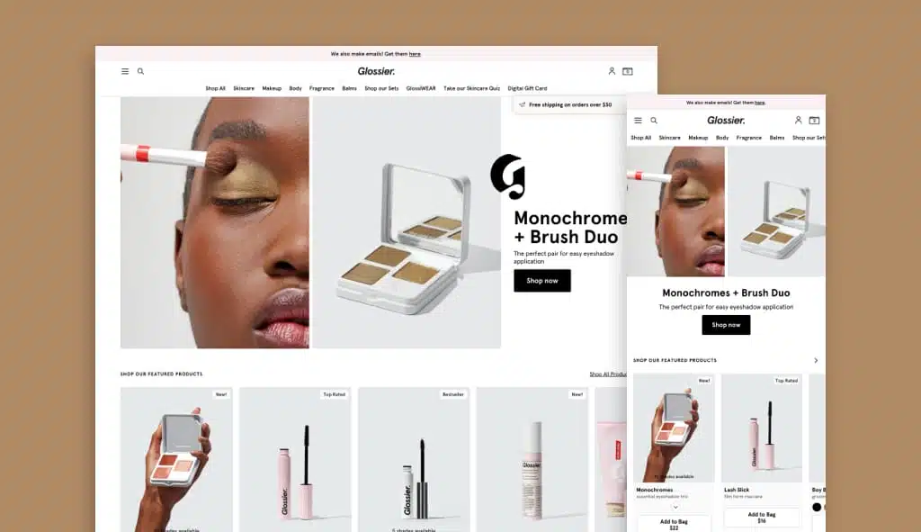
Glossier’s website showcases “consistency” because it uses a color palette similar to the colors of its products. It also managed to add little pops of colors to every webpage without going overboard or steering away from its brand.
Aside from being aesthetically pleasing, every page of the website is also informative as they display vital information that users should know about the products — from its benefits and available sizes to instructions on how to use them.
Another reason Glossier is on our list is because they are an ecommerce platform that allows for users to find the products they are looking for in a short amount of time due to their overall organized web design.
4. Amazon
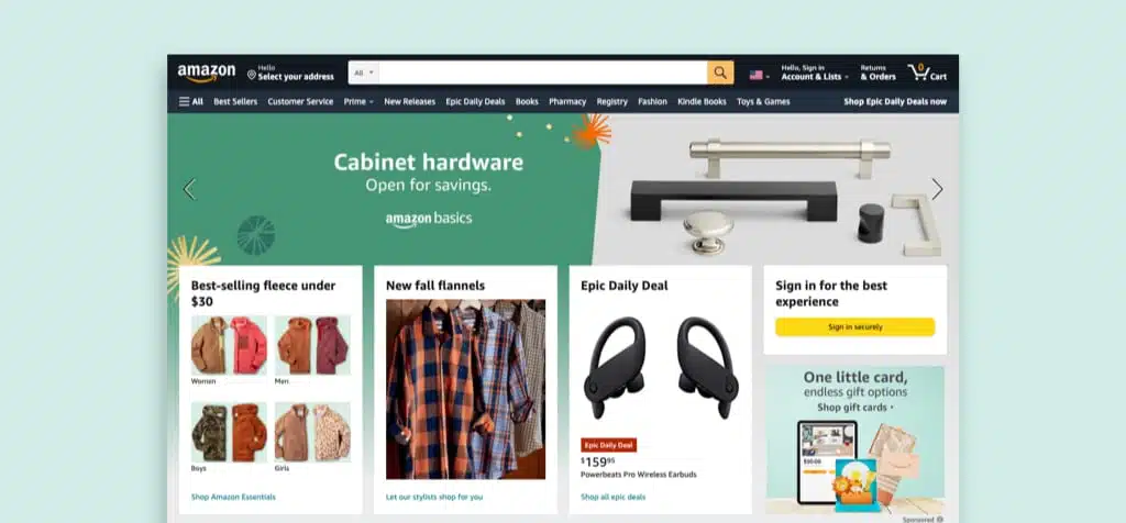
One noteworthy feature of Amazon’s website is it displays a lot of shipping and product information without making the platform look cluttered. Users can easily find products on the website as everything is categorized properly.
Amazon’s website also shows products inspired by a user’s browsing history. This means that if a user searched for pellet grills, the website will then display hardwood pellets, dripping pails, and beef rubs.
5. Perky Jerky
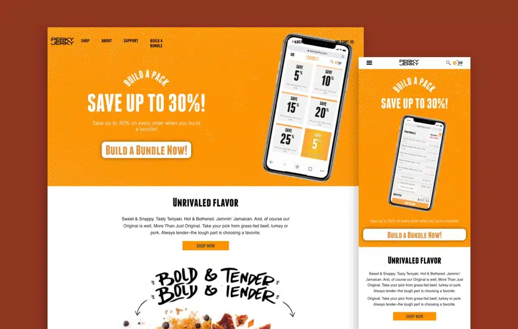
Perky Jerky’s website stays true to its name — it uses high-quality images and bold color palettes to make the page feel and look cheerful. When accessed through a smartphone, the website also shows animations that don’t interfere with the navigation or experience of the users.
The products on the website are categorized so users can easily find what they’re looking for — whether they want to purchase turkey jerky, beef jerky, or vegan jerky!
6. REI
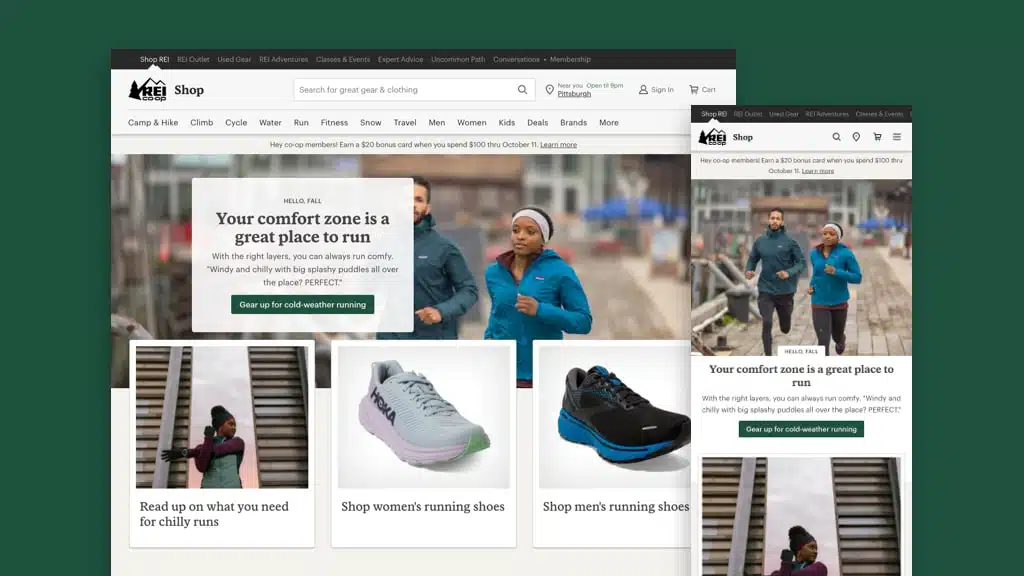
The use of earthy tones on their website matches the brand of REI. Headers and footers are properly highlighted using bold shades of green, and descriptions are visible as these are presented in solid black colors.
If there’s one thing the website can improve on, it’s the number of categories presented on a webpage. Some users find the header and footer navigations too congested, which can become an issue down the road.
7. Thomas Than
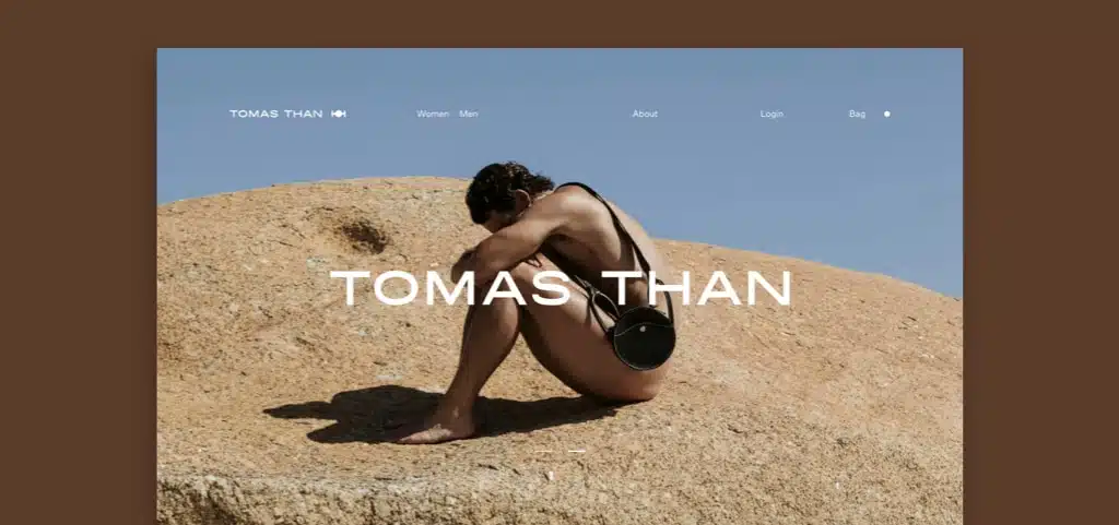
Thomas Than’s website welcomes users to their website with a choice of which version of the website users want to visit. The cleanliness of Thomas Than’s website makes it stand out from the competition. Although the website is filled with attractive models, the focus remains on the products.
The products on the website are also categorized into just two — men and women. This makes it more convenient for users to browse through different products and find what they’re looking for within minutes.
8. Aisle
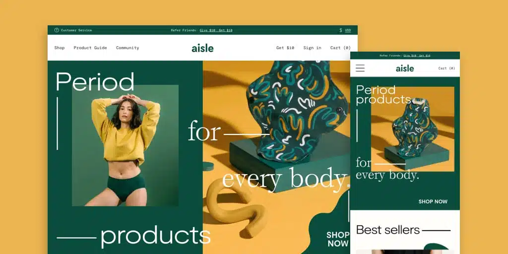
The use of bold colors is very prevalent on Aisle’s website. Bright colors of green, yellow, orange, and blue can be seen throughout the website. Even with these colors, though, the website remains clean as the colors are used strategically to create sections.
Another cool thing about the website is that its cursor changes to a “buy now” sign when users hover over the products. This quirky addition brings more character to the website and allows users to have a little bit of fun as they navigate through it.
9. Bite
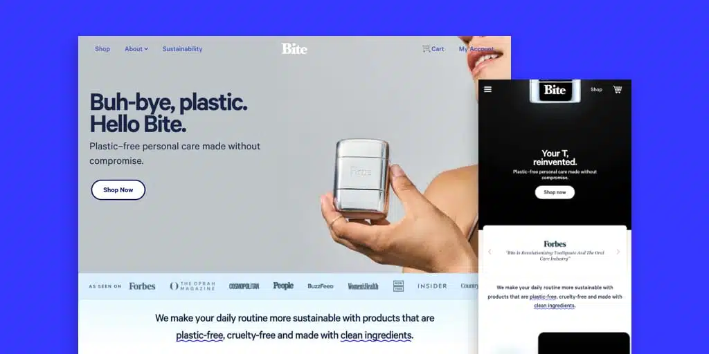
Bite’s website uses a softer color palette with shades of blue and gray but still manages to create a bold and fun-looking platform. The color choices on the website create a calming effect that perfectly describes the benefits of using Bite products.
The animation on the web pages is also a nice touch because it brings more appeal without distracting the users from reading the information presented online.
10. Pura Vida
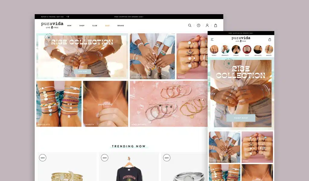
Pura Vida’s website uses design elements that communicate to their target audience: the youth. The simplicity of the website allows users to easily navigate through the web pages and find the products they’re looking for.
One thing that makes Pura Vida’s website unique is its integration of Instagram feeds at the bottom. In this section, users can find images of customers wearing Pura Vida’s products and quickly “shop the look.”
The product photography is also great! They also highlight images from social media onto their website to show images of their products.
Right now they also have a contest for a shopping spree, the contest pop-ups to users as they enter the site.
11. American Eagle
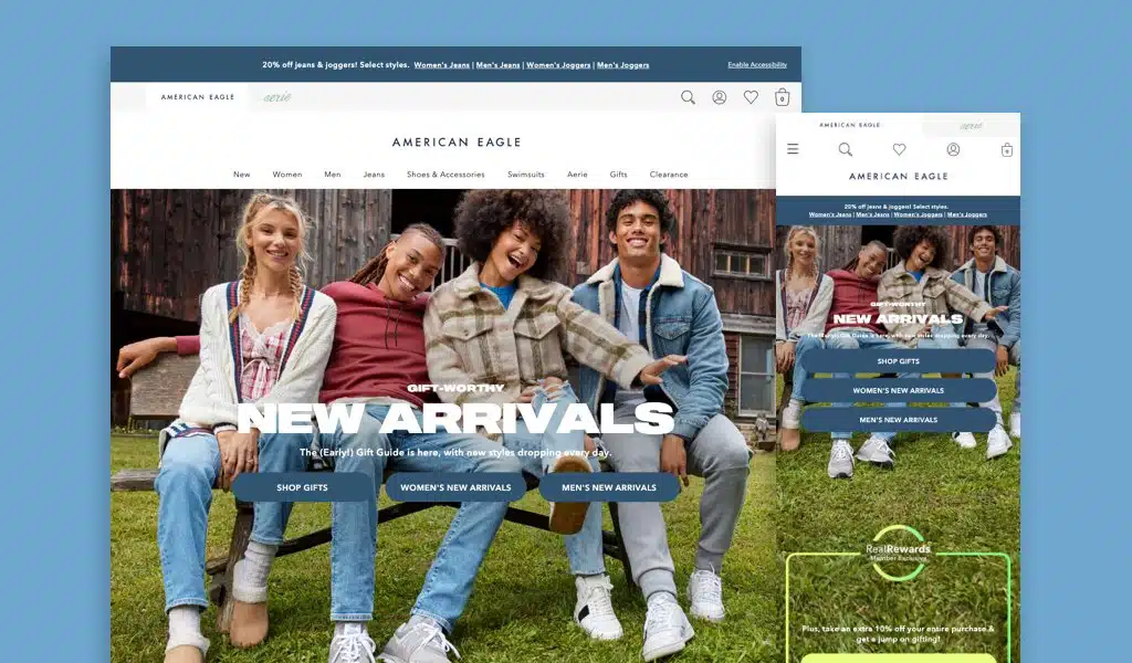
American Eagle’s website has definitely improved over the last five years as the brand stepped up its visual appearance by using high-quality images. The website displays images of models wearing American Eagle products and users can click on these images to access varieties of that product.
The website uses various shades of blue all over, which ties the website together and makes the platform aesthetically pleasing.
12. Everlane
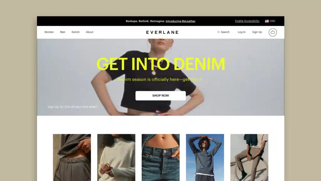
Everlane’s website design is clean as sections are showcased through images in the same dimensions. The website also uses white as a background, which allows the images to pop and stand out.
Everlane’s website design isn’t just appealing but it’s also very functional because it’s optimized for mobile devices and contains lead generation tools, namely a denim sizing guide. The website also includes an integrated Instagram feed so users will know what hashtags to use if they post pictures of Everlane’s products online.
Protip
Have a strong navigation, a beauty footer design, and a great strong service page are all key elements of retail websites. For more tips, check out more of our articles in our Optimization Series!
13. Robin Golf
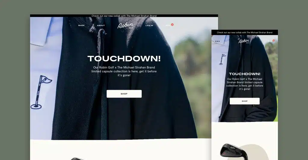
The use of lifestyle imagery and unique uses of animation make Robin Golf’s website very engaging. Users can navigate through the website and find everything they want to know about the brand — from the type of products Robin Golf sells to the reviews left by their customers.
When users enter the website they are welcomed by a $25 off your first order, this deal pop ups as users scroll through the website after a short amount of time. It encourages users to add products to the shopping cart.
14. Nixon
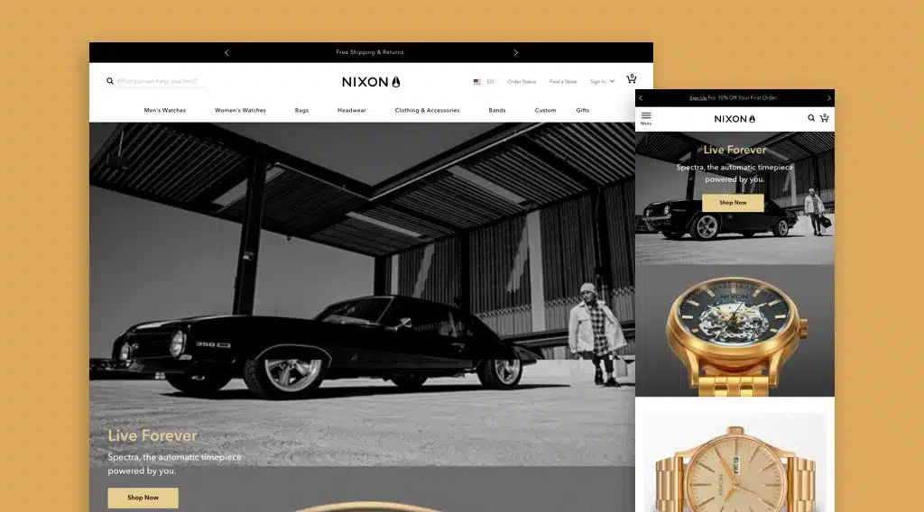
Nixon sells different accessories but still maintains a clean-looking website. The website effectively displays a wide variety of products without making it look too cramped or cluttered.
Every product sold by the brand can be found in different categories. The website also showcases some of the brand’s discounts and promotions, and images of customers wearing the products.
15. Madewell
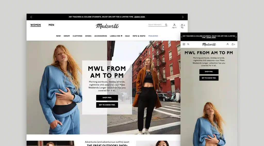
The stylish color palette on the website shows how elegant Madewell products are. Although the website displays several models and product images, everything was arranged strategically to ensure that users can navigate through the website without any problems.
The product sections are also very easy to find, saving first-time users time and effort in finding the information they’re looking for. Overall, Madewell’s smart use of images and clean styling makes it a very user-friendly website!
16. Nordstrom
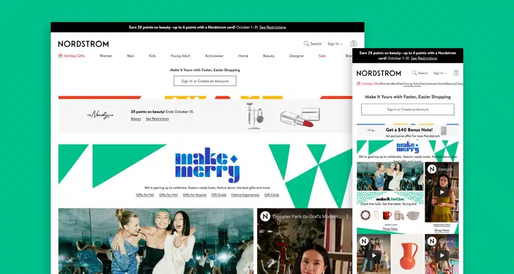
Nordstrom displays a lot of things on their website — from their wide selection of products and celebrated artists of the month to featured collections and shopping processes. Users can learn a lot about the brand just by checking out their homepage.
The website uses a stylish color palette, but this doesn’t get in the way of users navigating through the platform. This is thanks to the website’s clear navigation tools.
17. Other Stories
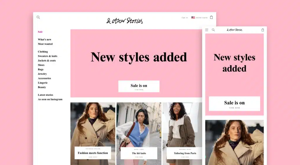
The web design of Other Stories is very creative because it uses images as product categories and to showcase collaborations with different artists. The website also uses images to highlight customers who are using Other Stories products and information on proper product care.
Even with an abundance of images on one page, Other Stories is still able to maintain a clean web design because the images complement each other. The website also has easy navigation options so users can find various product categories.
18. Throne
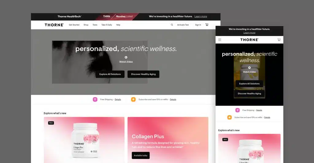
Throne’s website uses blocks to divide information presented on the homepage. This technique allows the brand to showcase products equally while ensuring that users still navigate through the website.
The website also uses an animated header to give users a glimpse of what the brand is all about and the type of products they sell.
19. The Feed
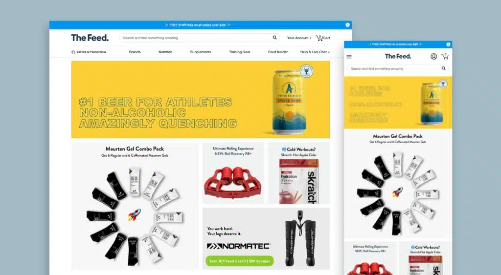
The homepage of The Feed’s website is very organized because products are displayed in blocks. Users can browse through the website and easily find the best, featured, and on sale The Feed products.
What makes The Feed’s website different is that it also showcases various health and wellness articles. This information can be a godsend for users who still don’t know which products to buy from the website or how these products can affect their wellness.
20. Nuun
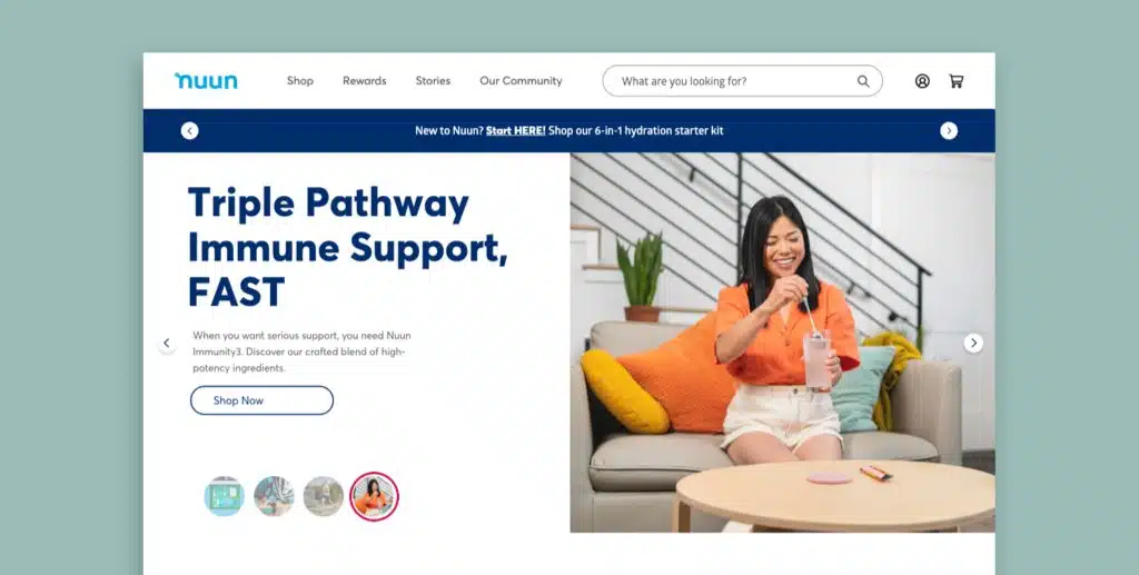
Even with a white background, Nuun was able to make its website attractive and functional by using colorful graphics and images. The white background also allows the products to stand out from the website.
Aside from the unique animation, Nuun’s website also shows the brand’s purchase process using a colorful cartoon character. This makes the online platform very cool and hip!
21. Room
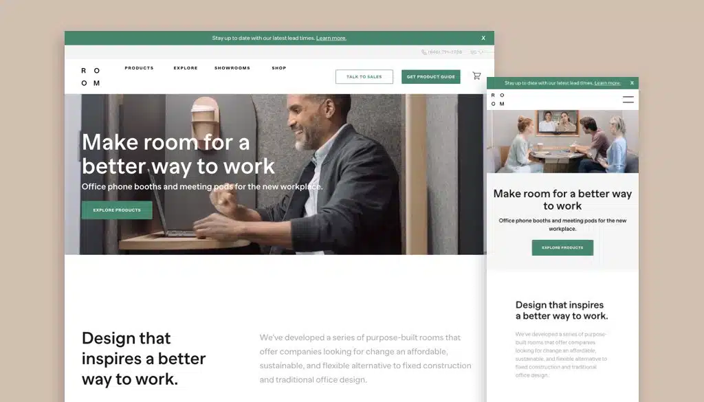
To show what Room does and the kind of products they provide to customers, the brand uses a video on their homepage. Even without audio, the high-resolution video is very informative and allows users to know more about the brand within minutes.
Room’s website uses a very simple layout to convey benefits about their products and encourage users to visit their webpages. The website also features a chatbot where users can immediately have answers to any of their product-related concerns.
22. Seedlip
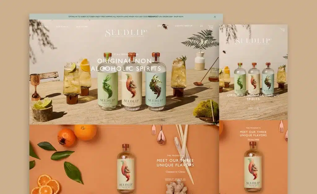
Seedlip’s website has a minimalist design but still feels high-end. The website also maximizes photos to give users directions as they’re browsing the webpages — talk about unique, right?
Aside from displaying different non-alcoholic spirits, Seedlip’s website also features different recipes where users can mix their products. The website even has a section where users can find bars that sell or use Seedlip products.
23. Kinship
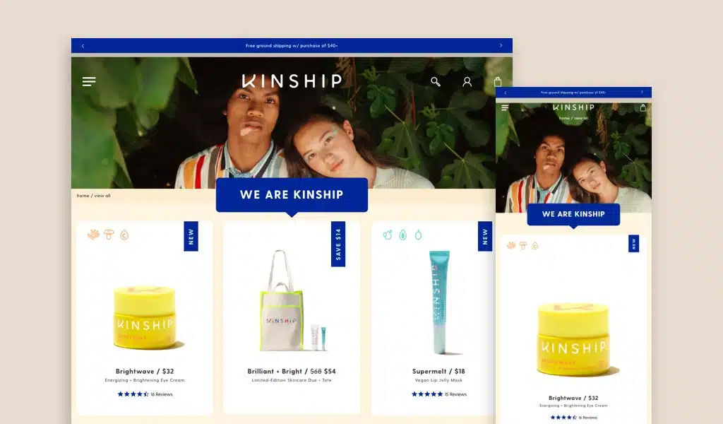
Kinship’s website uses a lot of colors and colorful fonts — perfect to showcase how fun the brand is. Even with the use of loud and colorful palettes, Kinship’s website still looks appealing because every element is used in moderation; nothing goes overboard.
Kinship’s service page is also visible from its homepage, allowing users to determine how their products are different from their competitors without going through several webpages.
Final Thoughts
With the number of sites online today, we’ve published this article to help you determine what design elements make up the best retail websites so you know how to create yours.
For more, check out our other articles that feature information on ecommerce website design!
Aside from the information presented here, make sure to research on your own as there are plenty of retail website examples from which you can draw inspiration!
Get Memorable Insights.
Sign up to receive actionable web design advice directly in your inbox monthly.
Get Memorable Insights.
Sign up to receive actionable web design advice directly in your inbox monthly.

Jeff Gapinski
President of Huemor
Jeff Gapinski is the President of Huemor where he helps plan the long-term strategic growth of the agency. Jeff is passionate about UI/UX, demand generation, and digital strategy.
What Do You Think?
Have feedback? Maybe some questions? Whatever it is, we'd love to hear from you.
Leave a Comment
![Website Design Standards We Follow [That You Should Too!]](https://huemordev.b-cdn.net/wp-content/uploads/2021/12/2023.04.04.Website-Design-Standards-We-Follow-That-You-Should-Too.jpg.webp)


No comments found