Design
13 minute read
Website Footer Design Best Practices + 7 Real-world Examples.
LAST UPDATED:
February 14, 2024


Most organizations don’t give much thought to their website footer.
(We’ve heard comments first hand from clients over the years that confirms this notion.)
At best, they consider it a catch-all solution for everything that didn’t fit into the original web design. At worst, they don’t think about it at all.
The truth is, your website footer is pretty important. People use them at a really high rate to get information they need quickly.
Website footers are safety nets. The typical user scrolls thousands of pixels in search of what they’re looking for. If they don’t find it in your website header, or within the contents of a web page, guess where they go next?
The right website footer design can increase your website conversions by more than 23% and your revenue by more than 15%.
Still feel like it should be an afterthought? I didn’t think so.
Before we dive into the how, let’s take a second to talk through exactly why you need to pay special attention to your website footer design:
- It drives conversions. See the above stat, plus the fact that you can actually leverage it for a secondary call to action. More on that later.
- It drives engagement. You can use it to point to your social media channels, build your brand, and highlight other key info.
- It drives purpose. Your website footer design shouldn’t just be a catch-all. It should quickly deliver key information your primary and secondary visitor’s are looking for.
Convinced yet? Great. Now that you know about the importance of a footer on your website, let’s talk details.
GET THE GOODS
Improve Your Whole Website With Our complete Website Optimization Series Checklist.

There are countless elements you can place in your website footer design. Not all of them are a great idea, though. Some are ineffective in that spot, and others might even take away from your website’s goals and focus.
At the time of writing this article, we’ve worked with nearly 150 different companies spanning dozens of different intudstries. These are the common rules we’ve found that can produce an effective website footer design regardless of your vertical:
- Don’t copy your site header.
- Fill it, but don’t overstuff.
- Highlight the key info.
- Assist your SEO efforts.
- Add a secondary call to action.
- Continue your branding efforts.
- Build trust with your audience.
- Don’t forget about the legal stuff.
- Include core resources.
Let’s dig into each one of these rules a bit more.
1. Don’t Copy Your Site Header
We’ve seen it too often. Businesses treat their websites like picture frames: the header at the top and the footer at the bottom are identical. It’s tempting, but try not to follow suit.
It’s especially egregious with many modern websites, on which the header navigation actually travels with the user. By the time you get to the footer, you see double—no value added.
Instead, treat your website footer design like letterhead. The same information across the top does not need repeated at the bottom. Instead, anything you add to it should add to the value your user get that wouldn’t be there otherwise.
Instead, find ways to highlight unique content in your footer. What type of content? We’ll get to that.
2. Fill It, but Don’t Overstuff
You actually have quite a lot of space in your footer. More than you in your header, and certainly more than you’d have in a side-bar or other graphic elements.
That’s tempting. You want to cram stuff in there. And you can actually fit a lot. But you absolutely cannot overdo it.
Like every other part of your website, your footer still needs to follow general best practices when it comes to whitespace. Avoid cramming the information into close quarters and instead give it space to breathe.
As with every other design elements, it’s all about finding that balance. The good news: with the information we cover below, it’s tough to go overboard.
3. Highlight the Key Info
Let’s talk about what type of information should actually live in your footer. Here, the easiest thing is following a simple rule:
Include key, general information about your company that your audience needs to know, but doesn’t fit into your header.
In practice, that can apply to a number of things. Your physical company address and contact info is chief among them. So are links to your social media pages.
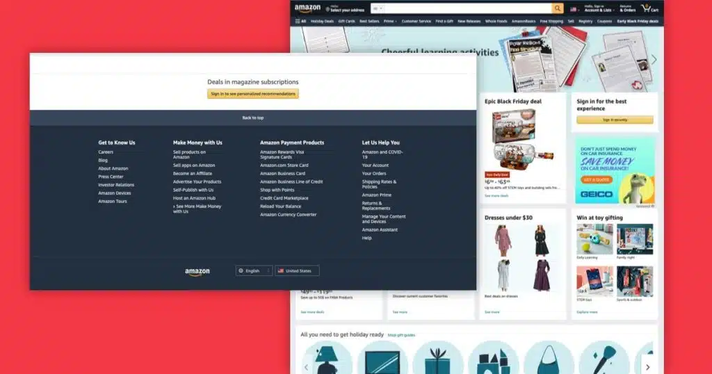
You can also go a little deeper, though. Literally. If you have key web pages that are a level or two down from your top-level navigation, link them here. Think about how Amazon lists its careers page and affiliate program information in its footer, but not in the main navigation.
Last but not least, don’t forget about your existing customers. A website footer is a great place to include links to key resource pages, help guides, and FAQs customers can find helpful when troubleshooting your product or service.
4. Assist SEO Efforts
It’s true that Google will prioritize header and body content over the footer. But don’t ignore the possibilities here. You still have some value to uncover.
That’s especially true with the deep links mentioned above. You might have pages deep in your site that still deserve the search engine optimization (SEO) attention they need for your core keywords. Your footer is your opportunity to highlight them.
Protip: Links from your front door pages to your deeper pages increase that SEO authority. You can use that knowledge strategy to leverage your footer as an SEO assist.
5. Add a Secondary Call to Action
Ask yourself: what’s the biggest thing you want your audience to do on your homepage and website? It might be to call you, donate to your nonprofit, or some other action. That call to action goes into your website header.
But you’re not done at this point. Ideally, your website footer can cater to a secondary call to action. It might be to sign up for your newsletter, request a free demo, or use a specialized tool.
The difference between your header and footer in this regard is simple: by the time they’ve scrolled, your visitors already have some knowledge about you. A deeper-lying call to action is perfect for conversions to push them down the funnel.
6. Continue Your Branding Efforts

Don’t forget about your website footer from a branding and design perspective, either. It might just be the perfect spot to add a secondary brand or logo, increasing recognition and recall for your visitors.
Another idea is to think your footer through thoroughly from a design perspective.
Can you cleverly carry through your branded web design scheme in this area of the page? What visual brand elements can you bring in that might also appear on your print materials, advertisements, or social media feeds?
It’s just another way to avoid treating the footer like a throwaway. Instead, use it strategically for more brand building.
7. Build Trust With Your Audience
Especially small and growing business absolutely rely on their credibility. They need to show their audience why they can be trusted against their bigger, more well-known competition.
The website footer is a great space to start building that trust. This is where you can tastefully highlight your service certifications, awards for past work, or security notices. We’ve even seen some businesses include reviews from third-party pages like Google Business, Yelp, and Home Advisor.
You cannot overdo it, of course. But if you really want to highlight some of those core credibility builders, adding them to your website footer designs makes sure they appear on every page of the site.
8. Don’t Forget About the Legal Stuff
The previous point is about the wants. But we know there are some needs as well. Let’s talk about those requirements in the website footer.
This is your space to make sure you add the key notices your audience deserves to know. It might be a link to your privacy policy or terms of service, easily clickable for your audience.
Of course, you can also go beyond that. Especially when catering to European audiences, noting your GDPR compliance in a prominent spot is vital. American audiences probably want to know about your ADA compliance.
There might be other legal notices required or preferred in your industry or state as well. If they get long, create a custom page and link to it from your footer.
9. Include Core Resources
Depending on your company and industry, your audience might want to know about some key resources on your site or others. The website footer might just be the perfect spot.
A manufacturing plant, for instance, benefits from linking not just to its own OSHA compliance but also general OSHA guidelines. Other industries might want to link to virtual tours or general industry resources.
This is the type of information that’s not required, so don’t prioritize it over the legal notices. Still, it can give your audience some vital extra content that will inform them and increase their affinity to your business and website.
Good with the basics? Great. Let’s dig even deeper. Because your website footer will likely change drastically depending on whether you’re focusing on business or consumers as your core audience.
Before we get into that, though, a quick overview of the core information all footers of all types of businesses should include.
Always Include Your Physical Location Information
This includes your address, phone number, and operating hours. But there’s a limit to what you should include here.
If you have more than three office or retail locations, add those to a separate contact page instead of including them all in your website footer. You can still include basic information like your central phone number or operating hours in the footer.
Always Include Your legal Information
That includes, at least, your privacy policy and terms of service/use if you have them. Beyond a GDPR notice and ADA notice as detailed above, you should also add any legal information required within your industry.
Got the basics? Great. So let’s get into what B2B and D2C website footer designs might look like.
The Crucial Elements of a B2B Website Footer Design
Every organization targeting business customers knows the nuances these buyers (and buying teams) require. It’s not a shocker, then, that your footer should reflect those trends and preferences.
Trust Elements
Start with your trust-building elements. Your certifications, awards, and other achievements can find a great home in your website footer design. That way, you keep driving home the fact that you’re worthy of building a long-term sales relationship with the buyer.
Highlight Key Services & Offerings
For this audience, you might also want to take advantage of the deep linking benefits we’ve outlined above. Highlight the deeper service and product pages that the site header might not get to. It makes for a quicker, more efficient navigation, and, in many cases, builds awareness to lesser known audiences.
The Core Pieces of a D2C Website Footer Design
Are you selling directly to a consumer-based audience? Now here’s a whole different situation. Some business-focused elements might still apply here, but they’re not nearly as central to your efforts.
Highlight Product Categories
Focus your deep links on product category pages that the site header might not get to. It makes for a quicker navigation to those product pages and shopping cart.
Highlight Resources Your Customers Will Find Useful
Your footer also offers the opportunity to highlight additional resources your audience might want to know about. Got some FAQs or basic information about shipping, your return policy, etc.? Here’s your chance to highlight it.
Get Their Email
Direct to Consumer brands that build e-mail lists sell more on average than those who don’t. It’s an easy and effective way to stay top of mind, and it helps build return purchases. Offer up a 1-time discount or a similarly enticing offer in exchange for their e-mail address.
For Those Who Don’t Fit in Either Bucket
You may not quite be B2B or direct to consumer and wondering “what about my website design?”.
The same general best practices we outlined earlier in the article still come into play. And as long as you focus on the core pieces, without overloading your footer or duplicating your header, you’ll be in good shape to leverage its full powers.
Also consider what important content your audience may need quick access to.
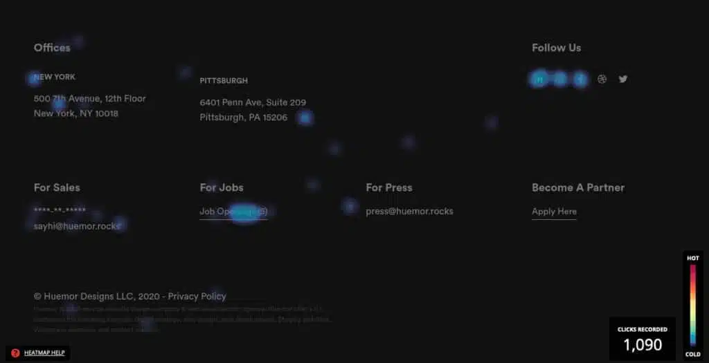
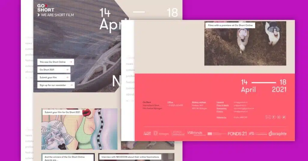
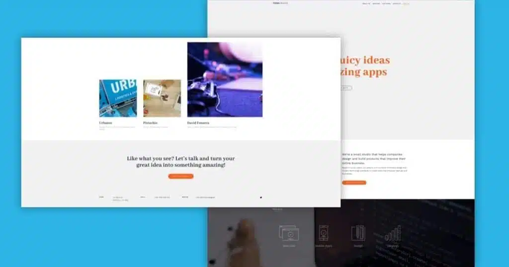
Waldo
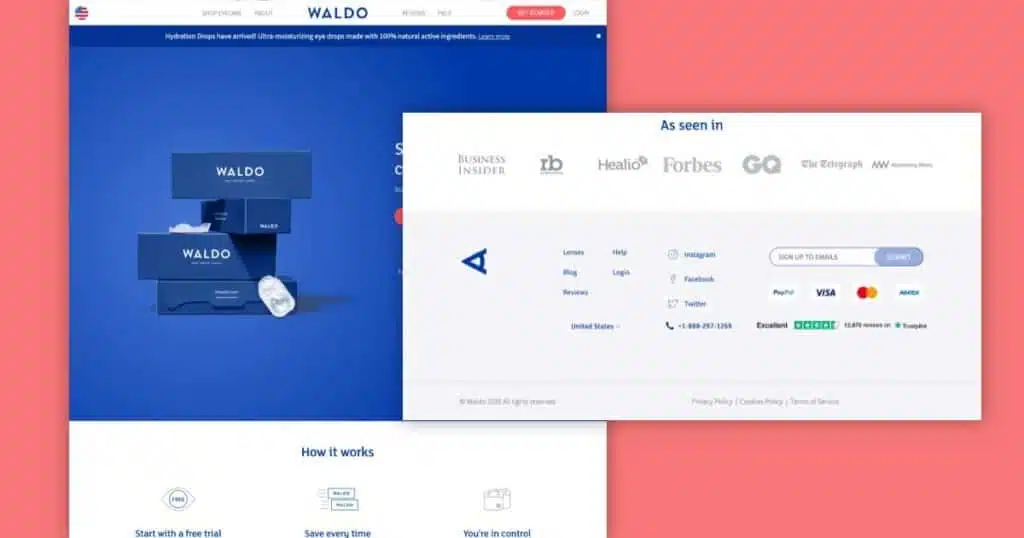
Waldo’s website footer design is simple, but don’t let that fool you, they’re accomplishing a lot.
- First to call out is that their secondary call to action is enticing visitors to sign up for their email list.
- They’re building consumer confidence through the use of their TrustPilot badge to add third-party recognition.
- Lastly, they make contact info easy to find by highlighting their help page as well as their phone number. Too many retailers or larger organizations make it prohibitively difficult to find helpful information when you need it.
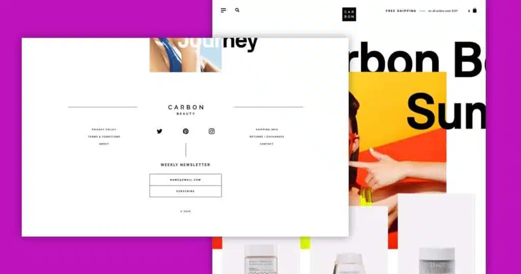
Prima
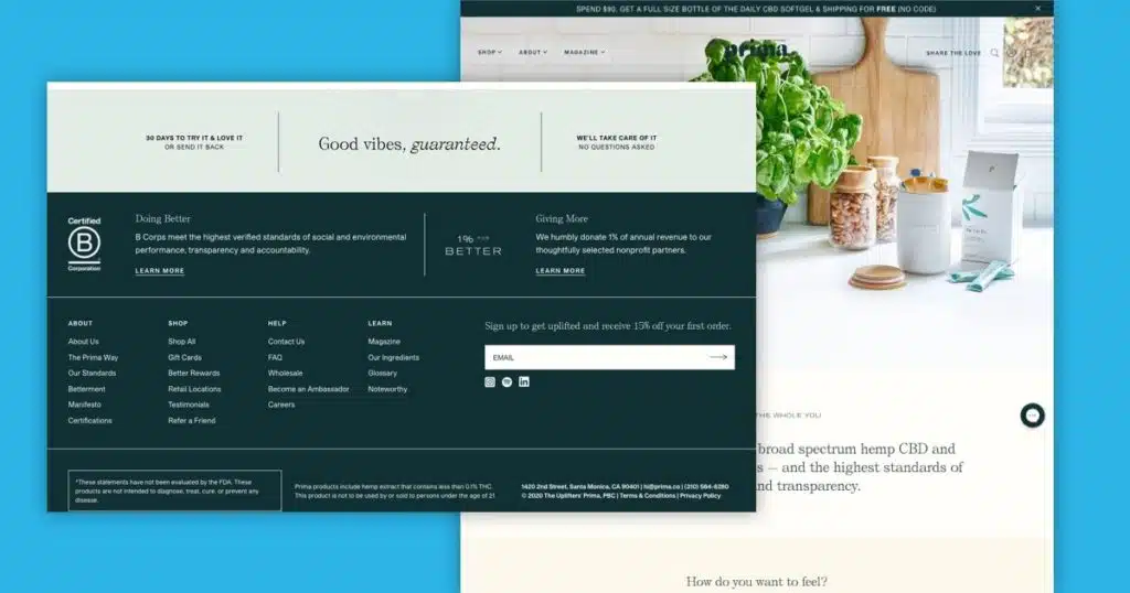
Prima’s footer design is a pretty far departure from Waldo’s minimalistic approach, but still equally as effective. We feel this is a great example of how a retailer can have more in their footer, but still prevent it from feeling overwhelming.
- The first things that jump out to a visitor here are the facts that they’re a B certified corporation and an active donator. These are two key pieces of information that I’m sure their customers appreciate.
- They also do a great job of making themselves available to their customers by easily allowing people to get their contact information and additional information about their products.
- Their secondary CTA to join their newsletter makes a clear offer as to why one should sign up (Initial 15% discount).
Protip
One thing worth mentioning is that, to a certain degree, they are breaking one of our rules by repeating links from the website header in the footer. We stick by our stance that these repeated links simply aren’t needed and could be discarded to either promote something else, or simply just present less.
Valarie
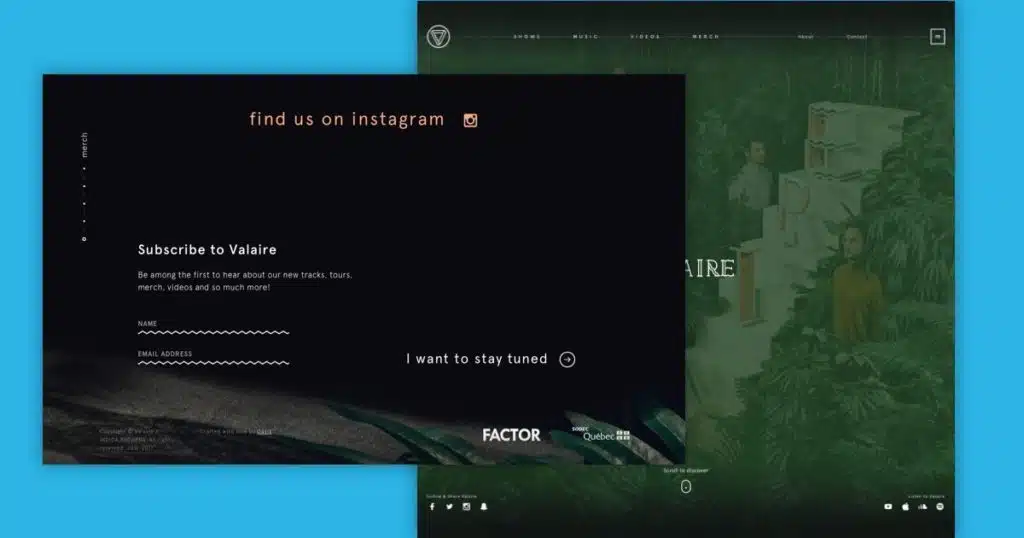
Valrie’s take on their website footer is pretty interesting and a great example of not letting it just be an afterthought.
- Their use of photography keeps the footer from feeling completely separated from the rest of the website. It also allows them to continue their branded vibe going.
- The use of animation for the newsletter signup input fields is pretty unique. It also effectively draws attention to the call to action.
Maggie Rose
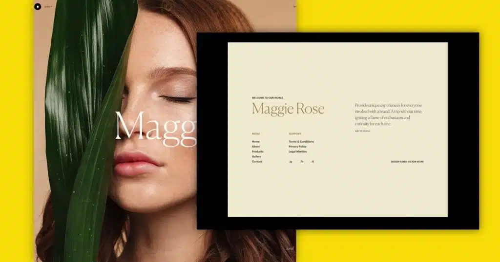
Maggie Rose’s footer is another great example of really thinking about design, and not just utility, when contemplating a website footer design.
- Unlike Valarie’s footer design, Maggie Rose’s footer design does feel distinctly separated from the rest of the website. In this case, we think it works really well here.
- The parallax reveal effect is a really nice touch.
- We like the fact that they’re using the footer to reinforce their mission statement.
Think Orange
Sometimes you don’t have to say or do a whole lot with your website’s footer, especially when you’re addressing more on each individual page. Think Orange is a great example of keeping a website’s footer simple without it feeling like an afterthought.
- The first thing that stands out is a clear call to action to work together.
- They make their location, phone number, and email address easily accessible.
Protip
Also worth calling out, I like that they’re just highlighting Twitter as their social platform. A lot of brands make a misstep and list every single platform they’re on vs the platforms they will actually be active on. If you’re not going to actively use Facebook to engage with your audience, don’t promote it in your footer.
Teem
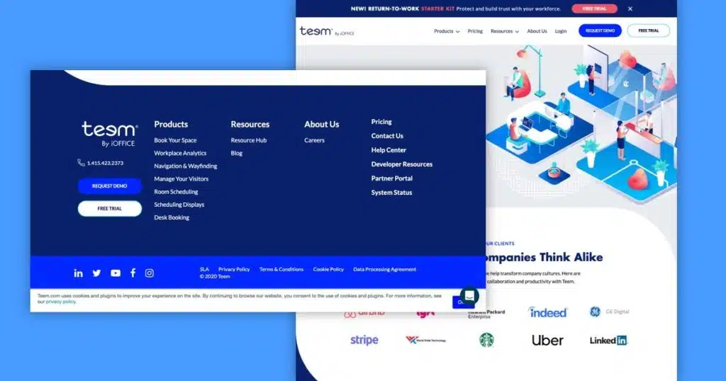
Teem is a great example for SaaS companies looking to make the most of their footer design.
- Their solid color background helps connect to the organizations branded accent color
- They’re reinforcing a few different calls to action here in level of priority. Phone number, demo, and free trial are hard to miss here.
- Despite repeating some of their main navigation links, they are highlight key links that presumably, are really important to existing customers, such as help center, developer resources, and partner portal.
Asana
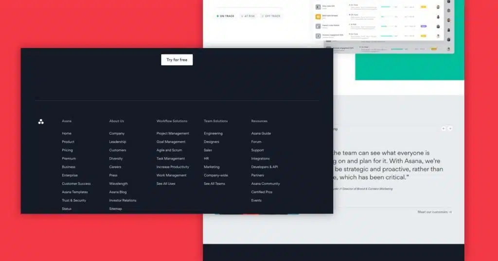
For those of you who may have larger sites that need to display a lot of links, Asana is a great example of having a lot in a footer without it feeling like a mess. Despite having 53 links in their footer (Yes, I counted them) the footer doesn’t feel overwhelming. There are a couple of things going on here to accomplish this.
- They’re using an adequate amount of negative space to give everything breathing room.
- They’ve also divided the footer into even columns with clear labeling.
- For the additional links, like Twitter, Linked In, Instagram etc. they’ve segmented them out into a separate bar.
What Do You Think?
Do you feel like there’s a website footer design we should include in our list that’s not already included? Let us know in the comments below.
Hopefully after reading this you realize there’s a lot more to your footer design than slapping in a couple of links and calling it a day.
It’s difficult to overstate, though, just how crucial your footer can be to a good user experience and information transfer.
Done right, it adds the finishing touches to the website experience. It gives your audience crucial answers, driving conversions and brand equity in the process.
Over to you: how are you building your website footer? What elements have you seen work well in this spot, and which ones are just overkill? Share your thoughts in the comments to start a conversation.
FREE ANALYSIS
Request Your FREE Website Analysis
Get Memorable Insights.
Sign up to receive actionable web design advice directly in your inbox monthly.
Get Memorable Insights.
Sign up to receive actionable web design advice directly in your inbox monthly.

Jeff Gapinski
President of Huemor
Jeff Gapinski is the President of Huemor where he helps plan the long-term strategic growth of the agency. Jeff is passionate about UI/UX, demand generation, and digital strategy.
What Do You Think?
Have feedback? Maybe some questions? Whatever it is, we'd love to hear from you.
Leave a Comment
![Website Design Standards We Follow [That You Should Too!]](https://huemordev.b-cdn.net/wp-content/uploads/2021/12/2023.04.04.Website-Design-Standards-We-Follow-That-You-Should-Too.jpg.webp)


No comments found