Design
23 minute read
Product Page Design: The Ultimate Guide (for 2022).
LAST UPDATED:
March 12, 2024
")

Your product page is the revenue driver of your online store.
A well-executed, unique product page design can dramatically transform your business. It is an essential component of good website design.
At the same time, a poorly designed product page can kill it.
In this guide, you’ll learn to create a product page design that sells more products, creates repeat customers, and grows your online presence.
Keep reading to learn about our product page best practices and tips.

What Is a Product Page?
A product page is a page on a website that showcases a product or service you’re selling. It includes a description of the goods and their features. The main goal of a product page is to facilitate the buying process by showing potential customers exactly how the product or service in question will elevate their lives.
What Is the Goal of a Product Page?
Conversio, an online marketing automation platform for ecommerce web stores, found that only 8% of all product page traffic converts to a sale.
That’s only 2 out of 25 people.
But that’s not the most interesting thing about that study.
It’s this:
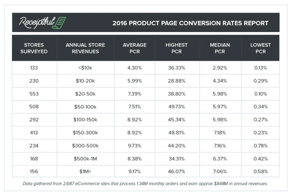
An online store making more than $100,000 in yearly revenue has much higher PCRs than an online store making less than $100,000.
(“PCR” is “product page conversion rate.”)
Stores making over $1M/year have a slightly better PCR than stores making $100k/year.
The difference? The $1M/year online store gets more traffic.
But a 9% PCR for a store that makes over $1M/year is beyond inefficient. (Think of all the wasted marketing dollars!)
…look at the next column.
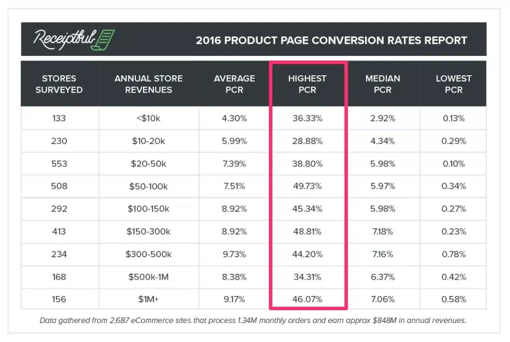
Some “unicorn” stores have conversion rates that approach 50%.
That means almost HALF of the people who land on their page buy something.
Let that sink in.
How would your business change if your product page conversion rate jumped from 9% to 50%?
What would you invest in if you 5x’d your sales?
This guide’s goal is to help you get there.
We’ve found that increasing conversion rates and getting your products to sell comes down to a few key things:
Messaging
Trust
Reduced Friction
The strategies in this guide will provide you with product page design examples and tips to help you improve your messaging, establish trust, and reduce the friction of clicking “Add to Cart.”
Keep reading.
Aside: Conversion Rates as a Vanity Metric
We don’t mean “increasing conversion rates” for the sake of increasing your conversion rate. We’re using “conversion rate” as a stand-in for “revenue”; that is, all else being equal, more conversions should yield a linear increase in your revenue. Increasing conversion rate for the sake of increasing conversion rate leads to some shoddy practices like slashing prices and cutting low-performing (but still profitable) paid acquisition channels. That’s not what we’re suggesting. Don’t do those things.
Even pretty buildings erected on shoddy foundations will crumble.
Your product page design—how you display the products—is just as important as its content.
Why?
Because people scan pages in specific ways. If the most important pieces aren’t in their sight, you’re leaving money on the table.
In this chapter, you’ll learn how to create a blueprint for an ecommerce website into a success story.
How People Scan Product Pages
Back in 2006, the Nielsen Norman Group discovered that people scan websites in an F-shaped pattern.
Like this:
(See how you can trace an F shape with the red on each of those images?)
This means that up-and-to-the-left is your money spot: that’s where our eyeballs at first land.
This reading pattern is foundational to all web development, including your product page design.
Since location matters, you want to place important elements where you’re confident shoppers will see them.
What Should Be Included in a Product Page?
Which sections should you include on your page?
The product details, of course—but what should be in there? What else should be on the screen?
In this chapter we focus on best practices. You’ll learn what the standard components of a product page design are and how to get the most use out of each.
Section 1: Product Details (Above the Fold)
The best product details sections consist of the product image, any relevant product information, and an add to cart button.
Calpak does this nicely with their product page design:
Notice a few key conventions:
1. Image on the left, text on the right
Like nearly every ecommerce store, Calpak follows the Amazon layout: the image is on the left, but the text is on the right.
2. Follows the F-Shape Pattern
People scan in an F-shaped pattern. This means the top of the image—all the way across—is the most visually salient. Therefore, it’s where you should place your title to adhere to best practices.
Here’s how the F pattern works on this image:
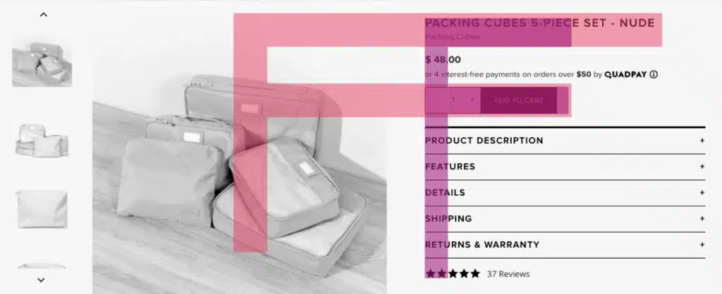
We don’t immediately look at the product in the product image.
Calpak understood that the headline is the most important part of this park. That’s why they placed it so it’s one of the first things your eyes encounter.
3. Product details conform to the shape of the image
CalPak strategically used accordions as part of their product page design to tuck the text away so that it doesn’t overflow and go beyond the height of the image.
This keeps the page tidy and establishes clear separate between sections.
Product details are only the most immediately relevant details.
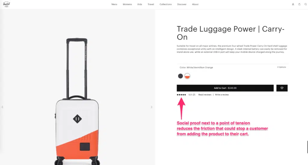
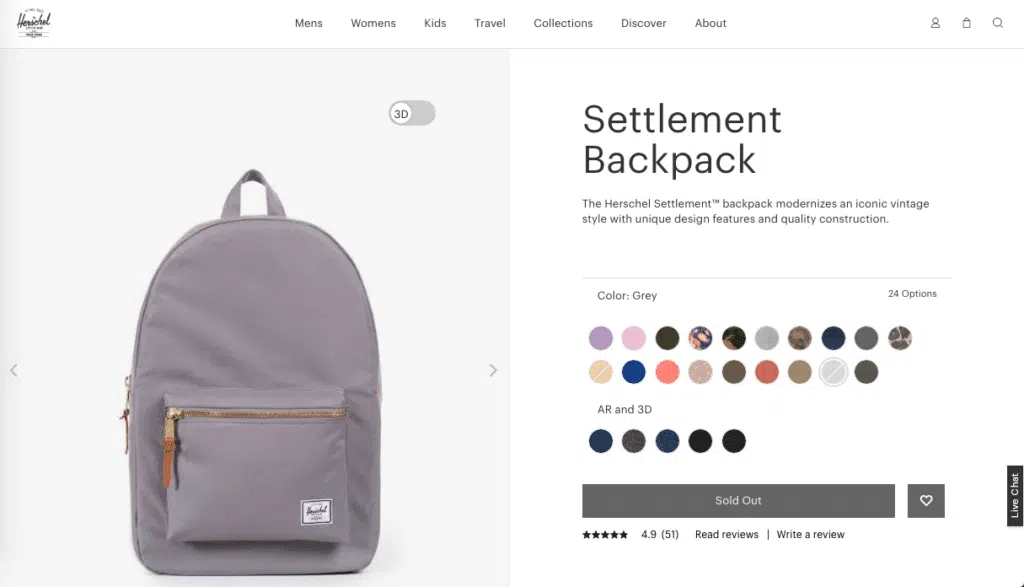
Here’s a breakdown of product details, from Herschel:
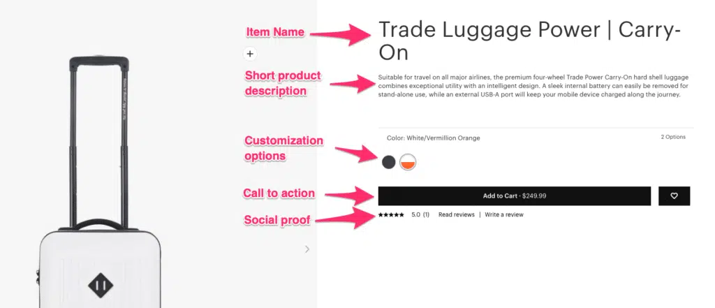
Name: The name of your product.
Description: A brief description of the product.
Customization: If there are customization options, put them here.
CTA: The “Add to Cart” button.
Social Proof: Herschel places social proof next to the CTA to help establish trust between the brand and the shopper.
Section 2: Additional Details (Optional)
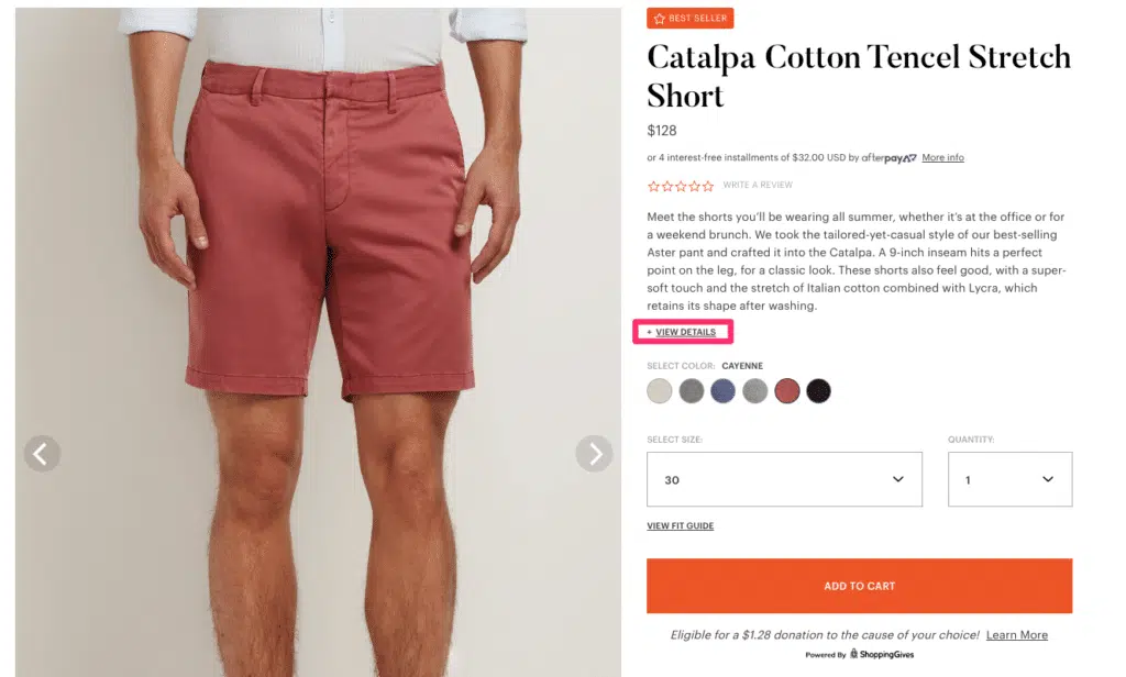
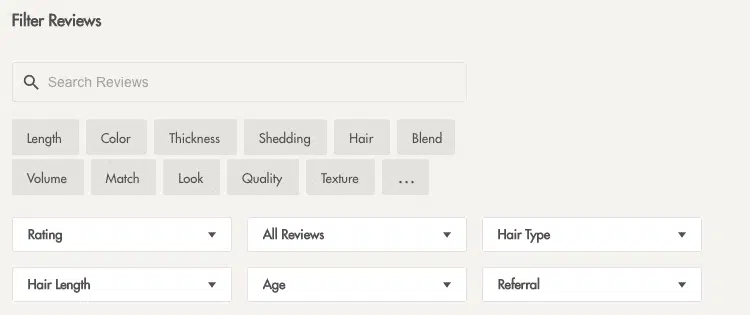
In an effort to keep the product page design short, some companies nestle additional details and specifications, such as sizing charts and similar products, in accordions and tabs.
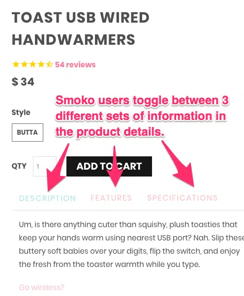
On Smoko, people can toggle between the description, a list of features, and the more mundane product specifications.
This keeps the product details section from becoming too overwhelming. It also keeps the focus on the Cart button.
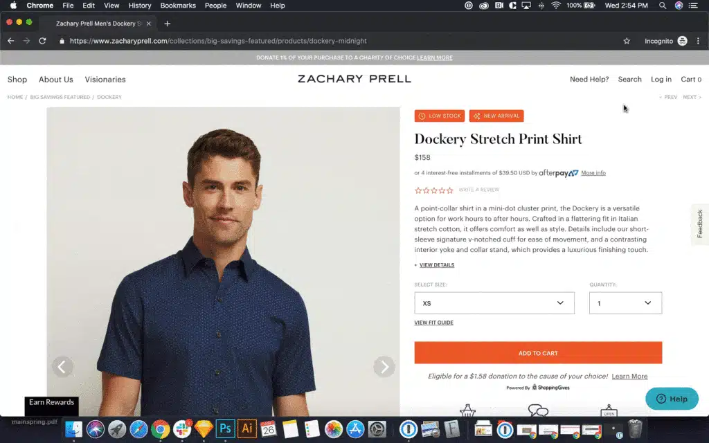
Zachary Prell‘s Shopify store web design includes an excellent product page. It’s easy for shoppers to read the short product descriptions. To keep the screen from being too long, Zachary Prell collapsed extra specifications beneath an accordion. Shoppers who want more information can expand that tab.
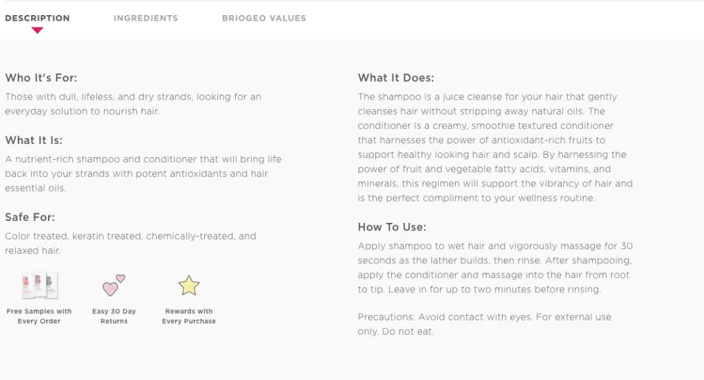
Briogeo uses tabs in the product details section to keep the product page design from becoming cluttered.
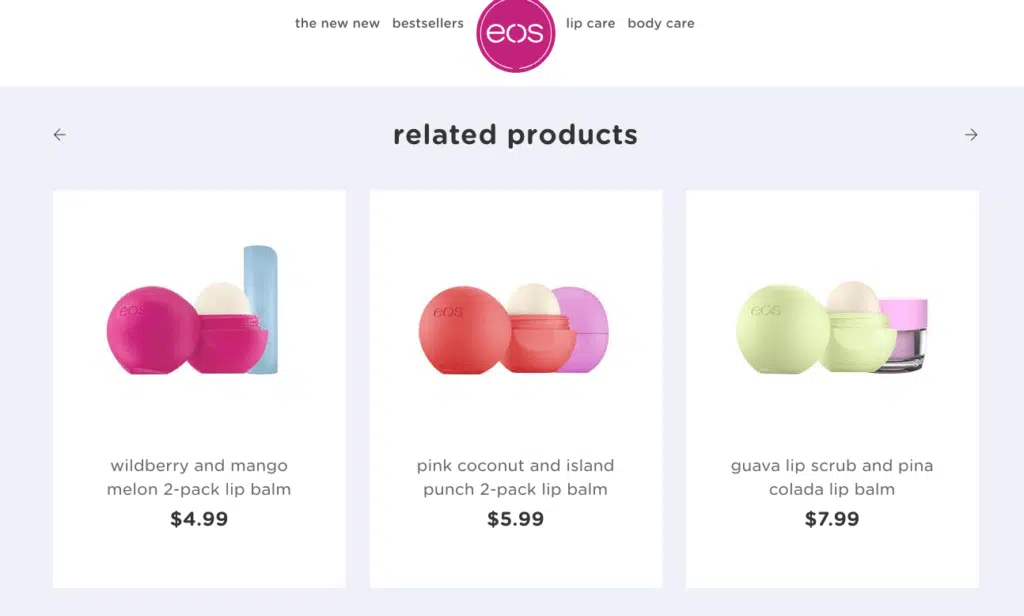
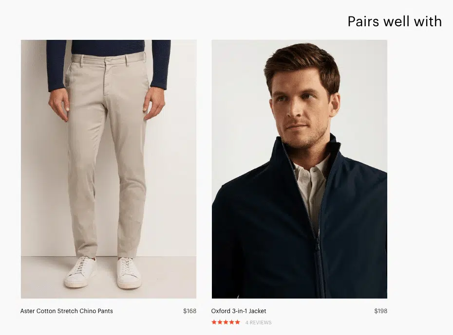
Section 3: Related Products
You always want shoppers to click on and view other items in your store.
(This is known as “cross selling.”)
That’s what your Related Products section is for.
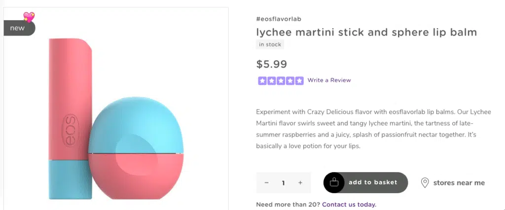
Sometimes this is simple, like what Evolution of Smooth (EOS) does:
But an even better approach is to show what complements the product on your page, like what Zachary Prell does:
We decided to show some items that complement the product that page sells when we designed Briogeo’s skin care product pages.
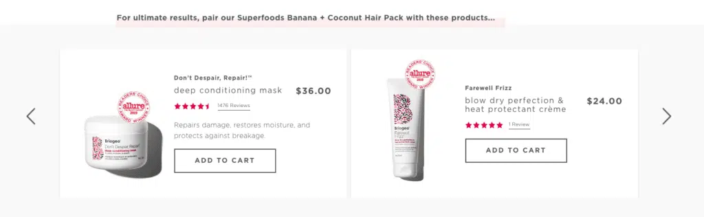
A complement-centered design is an excellent way to optimize your product page. This makes it easier for shoppers to select items that pair well with the page’s primary offering.
This improves the shopping experience, sure…but it also increases Briogeo’s average order value.
Bigger conversions mean higher profit.
Section 4: Social Proof and User-Generated Content
Social Proof is one of the most powerful tools at your disposal.
Why?
Because of a key principle of successful digital marketing strategies:
People like us do things like us.
Monkey see. Monkey do.
(Not to call your customers monkeys. Just illustrating a point.)
When your ideal customer sees other people like them enjoying your product, what more do you need?
This section can be as bare as you like. Look at this example from Figs:
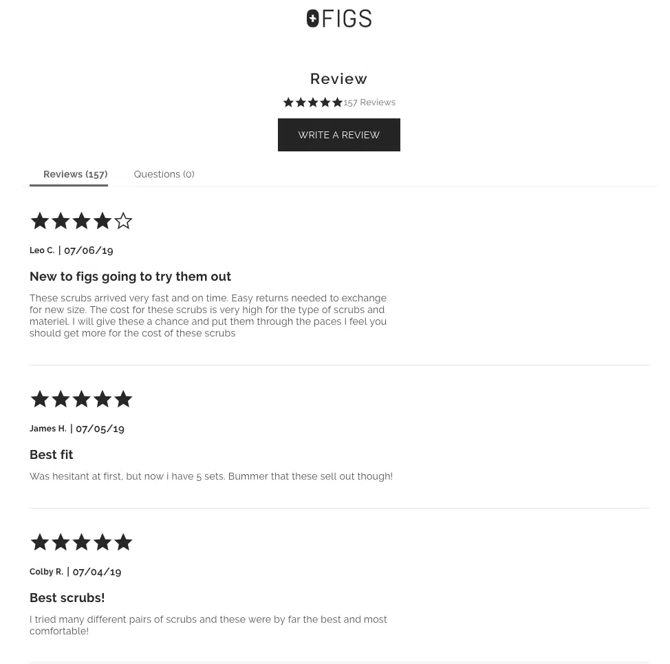
No images. No colors. Just stars, dates, and text.
Still effective.
(Although we don’t recommend giving people the option to leave a review without verifying that they’ve actually purchased the product.)
Section 5: Marketing/Business (Optional)
Even if you’re not making a sale on a page, that doesn’t mean you have to lose this potential customer forever.
Use this section as an opportunity to grab your visitor’s contact information (usually an email address).
Even if they don’t buy anything, you can still send them relevant information and market to them.
The easy solution is to add an opt-in at the bottom of the page.
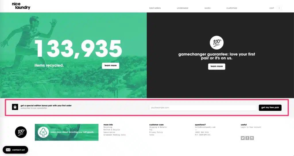
Nice Laundry uses a simple bar—not even a full section—to pitch value propositions (a special edition bonus pair…of socks, we assume) and ask you to subscribe to their newsletter.
Which is fine. It’s not outstanding, but it’s better than nothing.
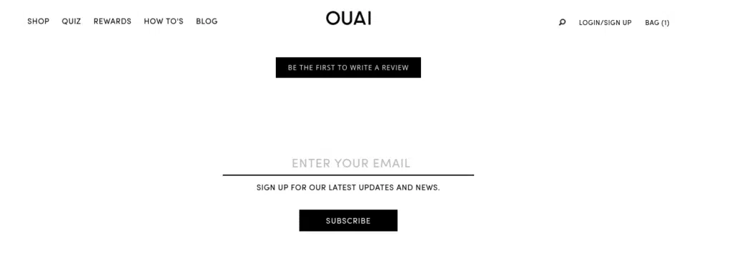
Ouai doesn’t even offer anything—they just pitch a vague “stay updated.”
This is almost definitely worse than Nice Laundry’s approach—it’s still a vague offer, but they’re not offering any incentive for parting with your email address.
How Sticky Components Keep Important Information in View
There are some things you want to always keep in the view when designing product pages.
Why?
Sometimes it’s to establish trust or make it easy for shoppers to find an answer to a problem.
Other times it’s because you want to keep key elements on the screen, like a special offer or the cart button.
Help Button
If you’re going to make anything sticky, it should be a help button.
Why?
In 2012, eConsultancy and BoldChat reported that 31% of online shoppers said they’re more likely to make a purchase after a live chat experience.
How much more likely? That’s unclear.
But we’ll take those odds.
MeUndies has a sticky live chat button on the bottom-right corner of their subscription box page:
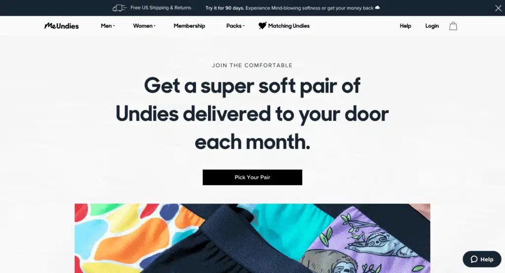
If shoppers have a question that the product page design doesn’t answer, they can use the live chat to get those questions answered.
Trust? Established.
Friction? It’s gone.
CakPak’s sticky help button offers both an FAQ section and live chat.
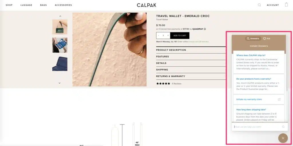
Including an FAQ can decrease the load on your live support. It also saves your website visitor’s valuable shopping time.
Remember: building trust leads to reduced friction. Keeping your help button (and live chat) always in view is a great way to do both of those things.
Add to Cart buttons
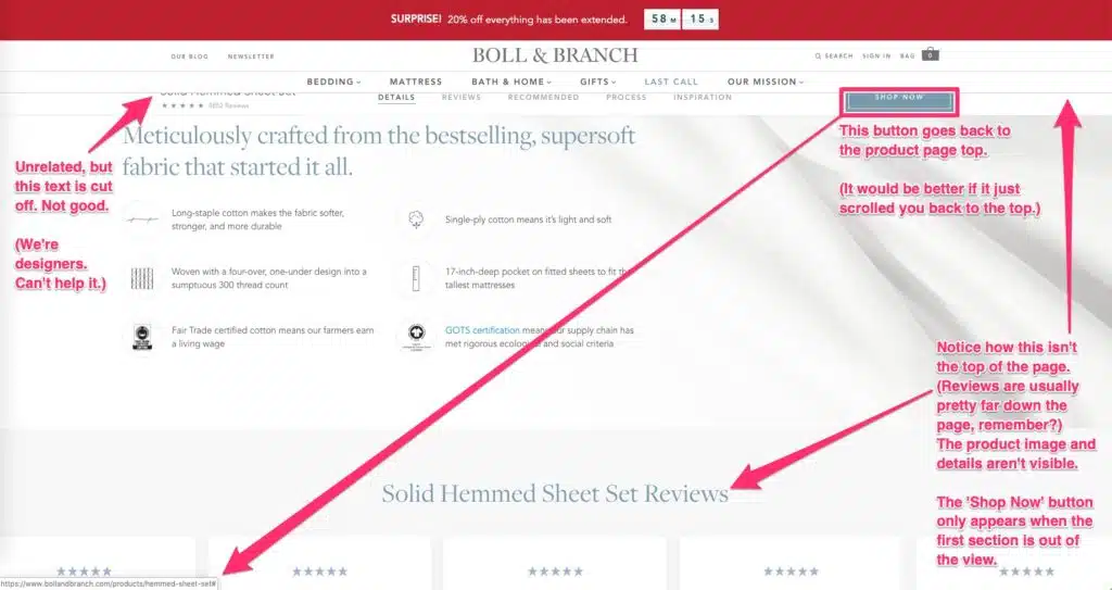
Boll and Branch adds a new bar to their site navigation when you scroll down the page.
Visual defects notwithstanding, keeping the CTA in view means keeping that option open to the shopper. One thing Boll and Branch does well with their product page design is constricting the number of options someone can take.
Choice is demotivating; if you’re going to introduce sticky CTAs like this, it’s best to make that the only choice on the page.
You’re probably overlooking your navigation.
But navigation is one of the most crucial pieces of a product page design.
Without an easy way to traverse the site, find search results they’re looking for, and check their cart, your ideal customer can get lost. Or worse—frustrated.
In this chapter, you’ll learn how to construct a navigation that makes it easy for shoppers to find exactly what they’re looking for.
How Menu Items Standardize the Shopping Experience
The main navigation is how shoppers explore your store. You want to show the essentials without overwhelming them with options.
If you have some leftover space, you can add links to pages that help you turn browsers into buyers.
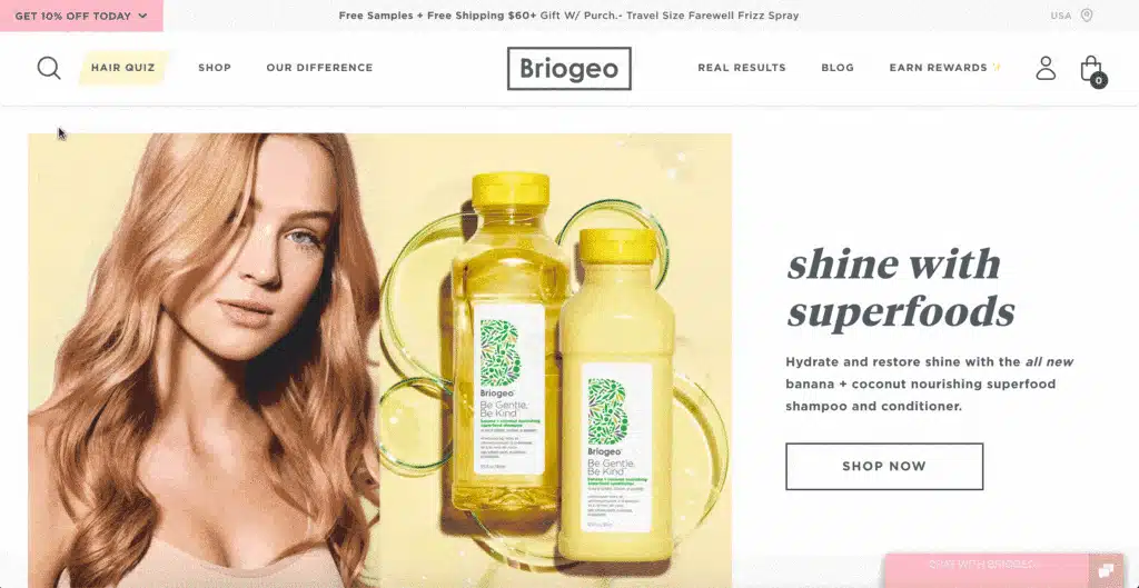
Take a look at Briogeo’s menu:

Links like the highlighted “Hair Quiz” button help Briogeo funnel visitors to specific pages.
Shoppers take a quiz and receive personalized product recommendations:
Of course this belongs in the navigation—it helps you send people to the best product options for them!
But that’s not the only approach.
You can also use your navigation to replicate the in-store customer experience and recreate the feeling of being in a different section of the store.
We like how Revolve split their navigation into Men’s/Women’s clothing:
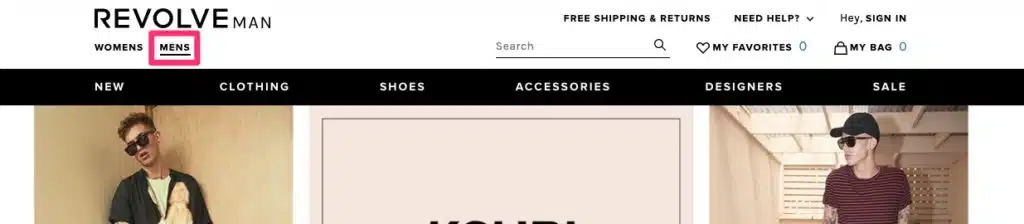
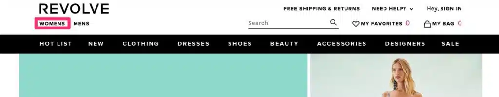
Notice how the navigation items change depending on which type of clothes you’re shopping for?
This keeps shoppers from ending up in the wrong section by mistake.
Use a Smart Search Bar to Funnel Shoppers to Bestsellers
Your navigation should have a search bar that helps shoppers quickly find what they’re looking for.
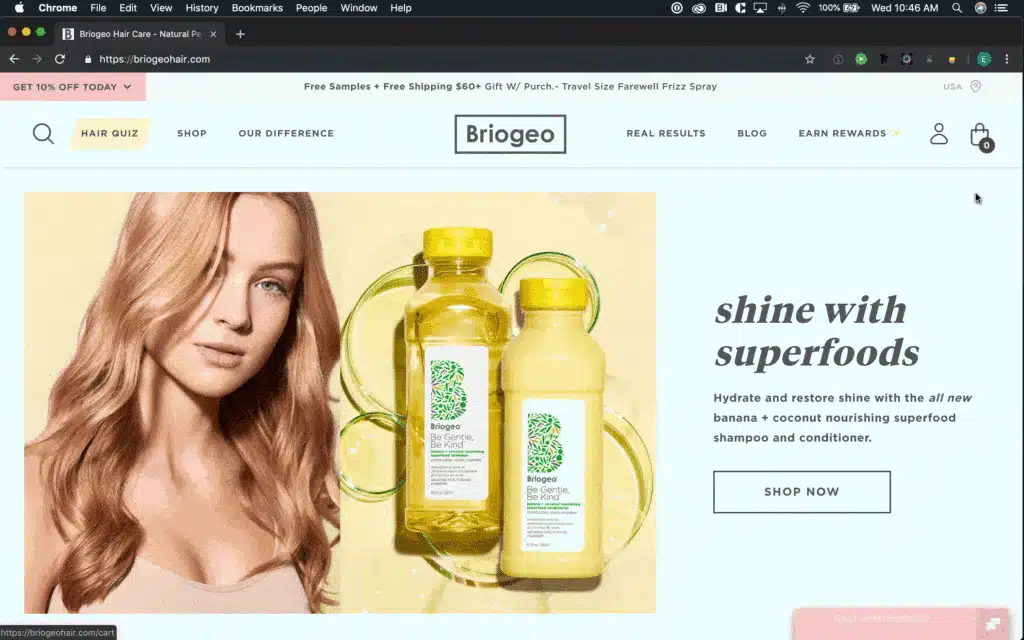
Briogeo’s search bar recommends items based on what you’ve typed into the search bar (if anything).
It’s not uncommon for someone to click the search icon and then draw a blank. Suggestions give them a jumping off point.
(This also helps Briogeo promote specific products—particularly items that sell well.)
Optimize Your View Cart Button for Maximum Conversions
Shoppers constantly view their carts.
You don’t want potential buyers to leave your product page because they wanted to view their cart.
Instead, design your cart view so that it overlays the product page design but doesn’t navigate shoppers away from the product.
If you keep users on your product page, you keep them in browsing mode.
Bringing them directly to the checkout page doesn’t force them to enter the checkout process, but it does bring them out of the browsing process.
High quality images are one of the most important parts of your product page design.
Displaying the product properly will showcase crucial product information, such as product design, size, and use.
But product videos, social media images, and crowdsourced content as social proof also affect how much you sell.
In this chapter, you’ll learn how to create visuals that deliver the maximum impact.
How do I Create a Product Display Page?
As a design element, photo size impacts how people perceive the product’s worth.
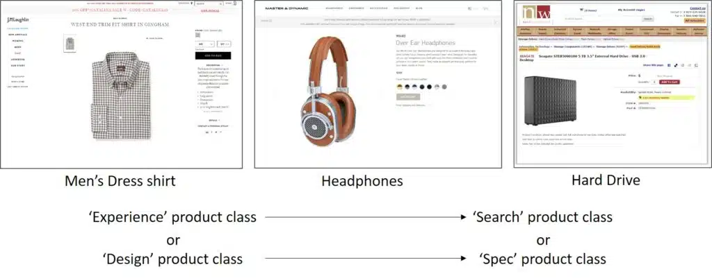
The ConversionXL Institute studied this in 2016. They divided products into “search goods” (spec-based items like computers) and “experience goods” (clothes, beauty products).
Bigger images made search goods seem more valuable.
For experience goods, the opposite was true: smaller images and more white space made experience goods seem more valuable.
Wild how much something like a photo’s size can impact your product page deisgn, right?
(See our guide to Shopify image sizing.)
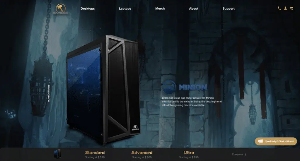
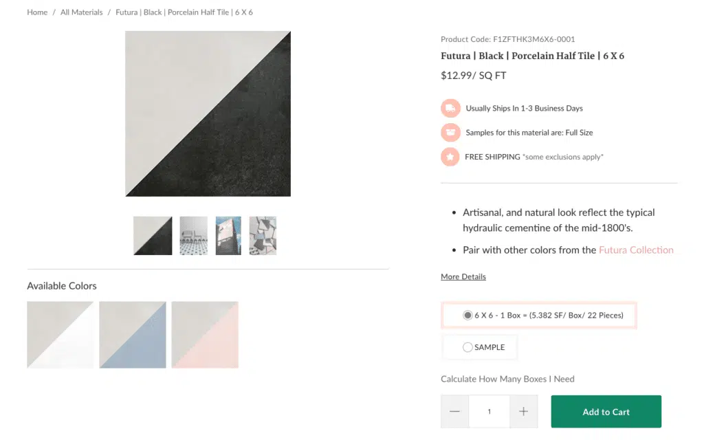
When we designed Ironside Computers’s product pages, we used big, domineering product images.

But when we created the product page design for Mission Stone & Tile, we knew that an experience-based product (like stone and tile) would do better with smaller product images and more surrounding white space.
If you sell a product that toes the line between “spec-driven” and “experience-driven”—like headphones—you can attempt both approaches with your product page design. Large product images AND lots of white space.
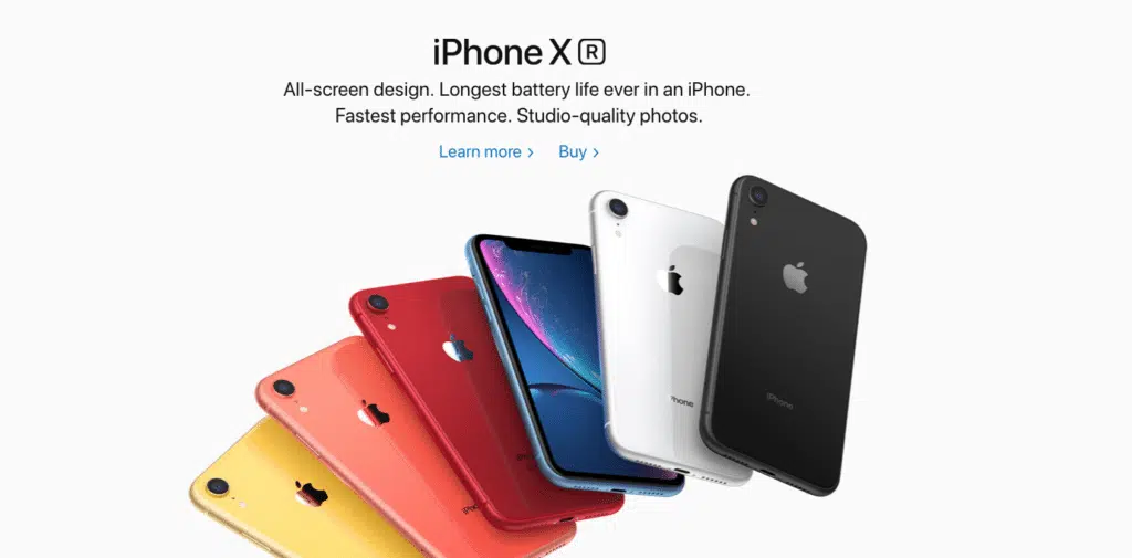
Clearly, it works for Apple.
Encourage Engagement by Modifying Image Size
The ConversionXL Institute studied how image size affects how long people spend on product page designs.
The results mirrored those from the earlier study.
Experience products with big images received less engagement than those with small images.
Spec products with large images received more engagement than those with small images.
(It’s worth noting that these effects weren’t statistically significant. There’s a chance these findings are incidental/random and nothing more.)
Small images performed better for experience products.
Large images performed better for spec products.
But there’s a caveat here.
Engagement is not a silver bullet.
By all means, test to increase engagement and time on page. It’s likely that more engagement leads to better conversions and fewer cart abandonments.
But optimizing for engagement shouldn’t be your goal.
Instead, optimize for perceived value. If engagement doesn’t follow suit, you probably need to make some tweaks.
Protip
You should always aim for high-quality images but make sure you follow best practices for image sizes, compression, and lazy loading to reduce their impact on your websites speed.
Show Video to Encourage Purchases
If a picture is worth a thousand words, then what is a video worth?
A lot more. Just the presence of a video—even if nobody watches it—is enough to increase your conversion rates.
In some industries—especially fashion—video can play a pivotal role in selling a product, especially on social media.
Video lets shoppers imagine how a specific item could look on them. More than static images, video captures real motion. It’s as close are you can get to the fitting room.
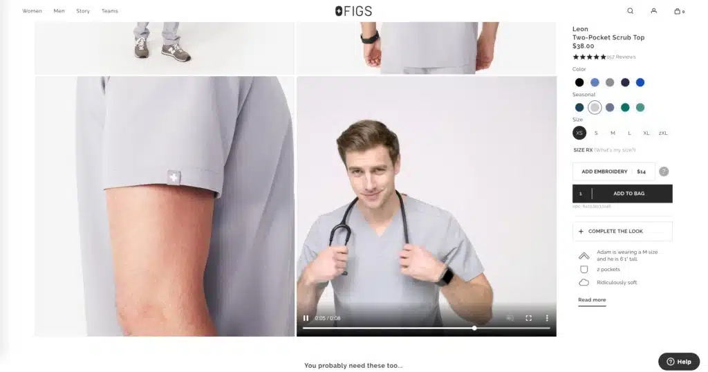
Figs uses a short video that shows a model wearing their product and dancing around.
Wyzowl reports that 74% of customers have been convinced to buy a product as a result of watching a video.
If that’s not reason enough to invest in high-quality video production for your website, we don’t know what is.
…that said, video is no good if it’s not obvious.
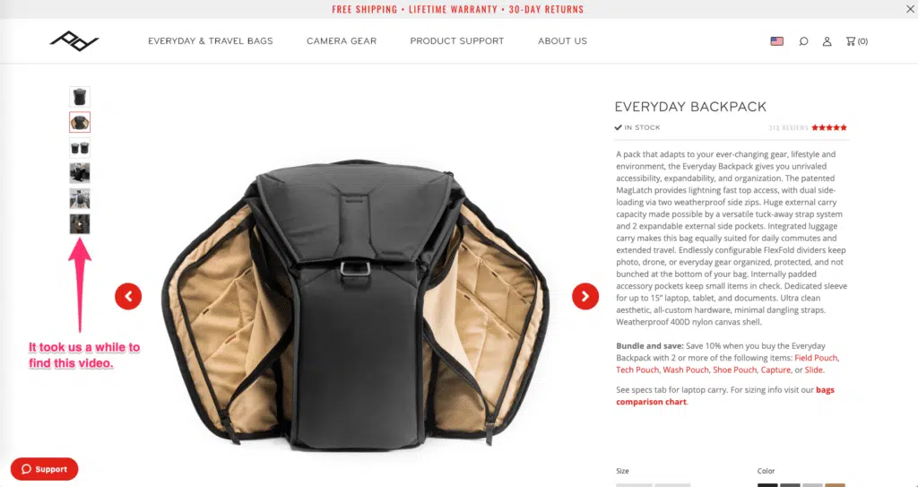
In this screenshot from Peak Design, there’s a video—but it’s hidden at the end of the image gallery.
If shoppers spend only a few seconds on a product page design, they’re not going to find that video.
If they don’t find it…it’s useless.
Put your video front and center.
Address Pre-Sales Objections with User-Generated Content
If you could show your shoppers that people like them buy your products…
What other objections could they have?
People like us do things like this.
It comes down to answering pre-sales objections.

How will this make my hair look?
How does this look on people like me?
How does it work when I use it like this?
The other factor is that shoppers trust each other more than the brand that’s trying to make money.
LuxyHair lets shoppers add photos to their reviews. This is some of the best user-generated social proof we’ve seen—not only are customer ratings generally positive, but you can see the product at work in the photos.
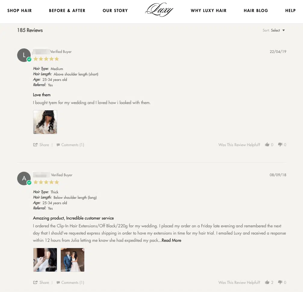
LuxyHair does another good thing with their reviews: they ask customers about their hair.
And then they let shoppers filter for reviews that match their hair type.
LuxyHair turned reviews into an extra sales tool.
Not bad.
The copy on your product page design can go just as far towards selling as the images.
Your product description is important, yes, but so is the social proof you display.
Even the text on the call to action buttons can dramatically shift your conversions.
In this chapter, you’ll learn how to write engaging copy that creates desire and sells more of your products.
AIDA: The Copywriting Formula You Didn’t Know You Needed
AIDA is a real copywriting formula. And it works.
Attention. Interest. Desire. Action.
Adhere to this formula as you construct your product description.
Look at this product page design example from one of the best beauty websites on the market—Briogeo:
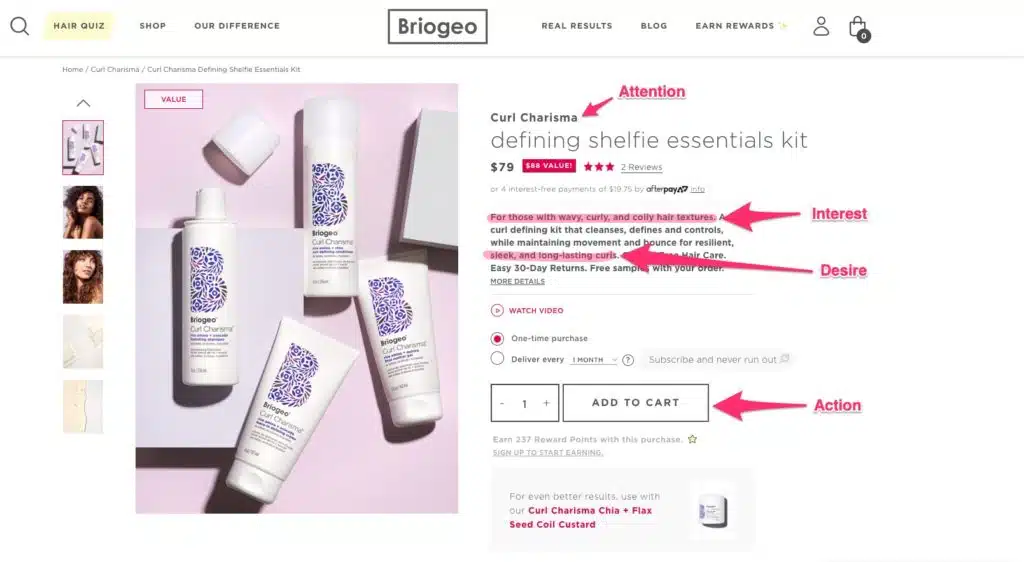
The product image and headline grab your attention. Curl Charisma. Defining Shelfie Essentials Kit.
The description immediately grabs (or rejects) your interest by telling you who it’s for: those with wavy, curly, and coily hair textures.
The rest of the description creates desire by describing the benefits. This products cleanses, defines, and controls while still maintaining movement and bounce for resilient, sleek, and long-lasting curls. You can have the best of both worlds.
Finally, the button at the bottom of the section functions as an effective call to action.
AIDA is everywhere because it works.
Format Product Descriptions for Maximum Impact
The ConversionXL Institute studied how people engage with product descriptions.
They found that:
- People read bulleted text more than paragraph text
- Text format matters more for spec products (e.g., tech) than for experience products (e.g., clothing)
But the core takeaway?
Your ecommerce product description matters.
…Remember when we talked about the F-shaped reading pattern?
It doesn’t matter how compelling your description is if nobody reads it.
Keep your main description under 4 lines.
Use accordions to let people access the minutiae that didn’t make the cut.
Change Your Product Description Content to Hit Hard Where it Counts
But what should your description actually say? How should you talk about your products? What gets people to buy—facts or feelings?
The ConversionXL Institute also studied this, albeit with mixed results.
Results were mixed. They found that hedonistic descriptions made people perceive low-end items like a coffee maker or a blender as more valuable. But people perceived a $1000 vacuum cleaner as more valuable when it had a utilitarian description.
Use feel-good language for low-end products.
Use utilitarian language for expensive products.
Neither finding was statistically significant and they didn’t study “experience” goods (clothes, beauty products, furniture, etc.), so you might not see these results in your own business.
We recommend testing your ecommerce store product descriptions between benefit-focused and utility-focused and measuring your online sales.
Social Proof Skyrockets Conversions
According to Yotpo data, reviews—a form of social proof—increased overall conversions by 161%.
There’s no doubt that you should include social proof on your product pages.
But where should you put it? And what should it say?
Next to points of tension.
Take a look at this example from Herschel:
Placing customer experiences and reviews next to the call to action—or any other point of tension—reduces fear and establishes trust between you and the shopper.
In other words, it can dramatically increase ecommerce conversions.
(But in this example, the low number of customer testimonials suggests this product doesn’t sell well. Be mindful because sometimes this transparency can work against you, too.)
Sometimes, it’s worth being creative with your customer reviews, like displaying a 1-star review to ward off people who aren’t a good fit and appeal to people who are:
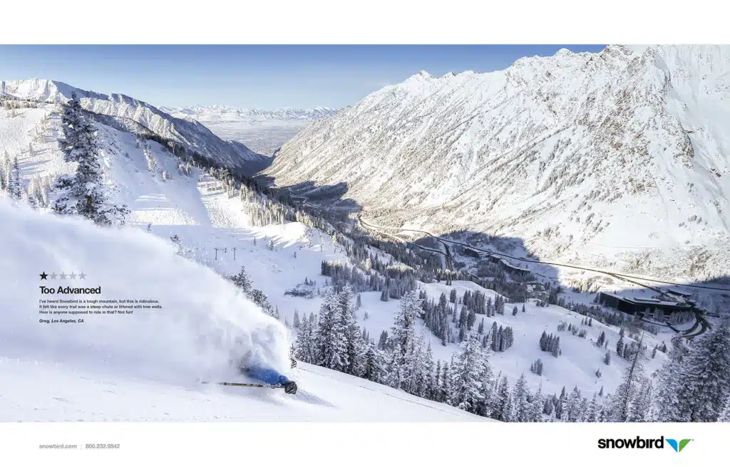
But in most cases, you should display your good product reviews.
It’s easy to get stalled on perfecting the look and feel of your product landing page designs.
But your landing page UI design should serve some purpose.
Guiding shoppers to a specific call-to-action.
Making the page easy to scan.
Highlighting a specific action.
In this chapter, you’ll learn how to use your store’s beautiful product landing page visuals to maximize the number of cart clicks on your product pages.
Use Color to Draw Attention
Color is interesting. It makes us pay attention.
Take a look at these two different product page designs, one from Evolution of Smooth, the other from Fresh.
Even though the only “real” colors are in the product image, the black and grey “add to basket” button stands out because it’s the darkest element on the page.
Contrast that with the product page design from Fresh:
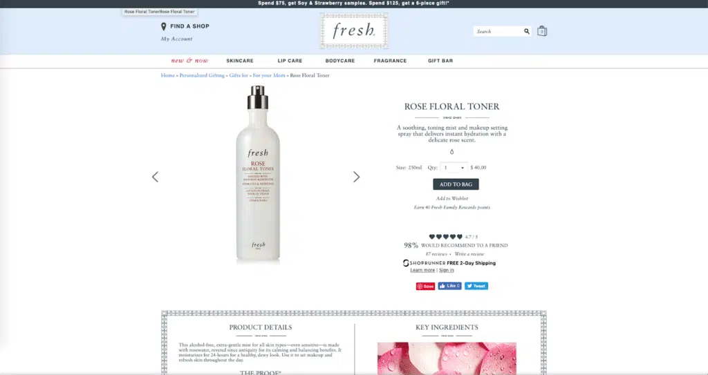
Like Evolution of Smooth, Fresh also uses a mostly white color scheme. But here, the “add to bag” button is not visually prominent because it’s the same color as other elements on the page.
…so how can you use color effectively to draw a shopper’s eye? And does it even matter?
First, let’s lay to rest the myth that certain colors are better for conversions. There’s too much conflicting research to prove one color converts better than another.
What matters is how you use color in your design.
Look at our homepage design:
It’s pretty clear where you should click: the pink button that contrasts with the green background and white text.
Zachary Prell does a good job of this:
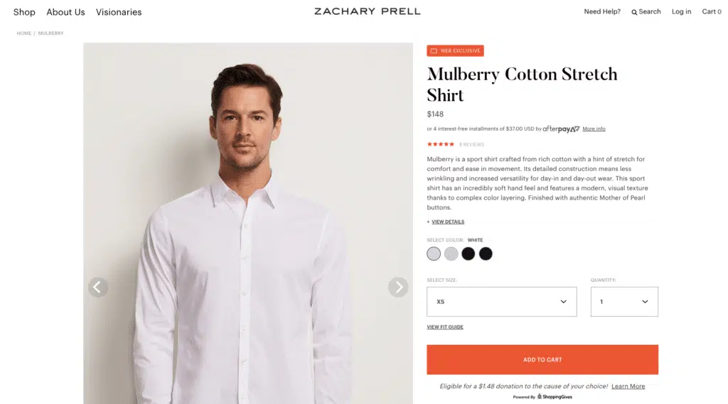
It’s obvious where to click: the giant orange button.
Here’s another example: Dormify.
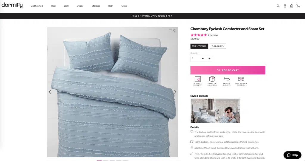
Even though we don’t love that the button is so high up on the page, the pink contrasts with the white-and-black color scheme on the website.
Reduce Friction with Smart Spacing
White space makes pages easier to process.
Why?
Because we chunk information in order to understand it.
This is called the Gestalt Principle of Proximity. It looks like this:
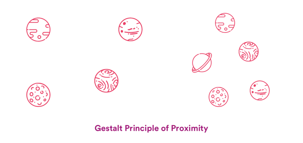
Notice how the planets on the right look obviously grouped, but the ones on the left don’t?
That’s the effect you want your product page design to achieve.
Introduce white space to make the chunking process easier.
Take a look at this ecommerce website design from 4moms:
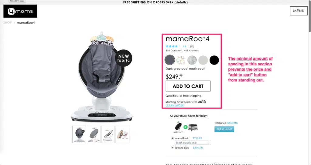
All that information in the pink box? That’s a single chunk.
(That’s a lot to process!)
It’s possible you missed a lot of the key information, like:
- The number of product reviews
- The free shipping
- The payment options (credit card, PayPal, etc.)
- All the questions and answers
Our eyes went right to the Add to Cart button and skipped all the other information in that chunk.
Contrast that with the product page design from Kith:

There’s plenty of white space around the image and the text. You can intuitively group sections—the headline, the sizes, the add to cart button, the details, etc.
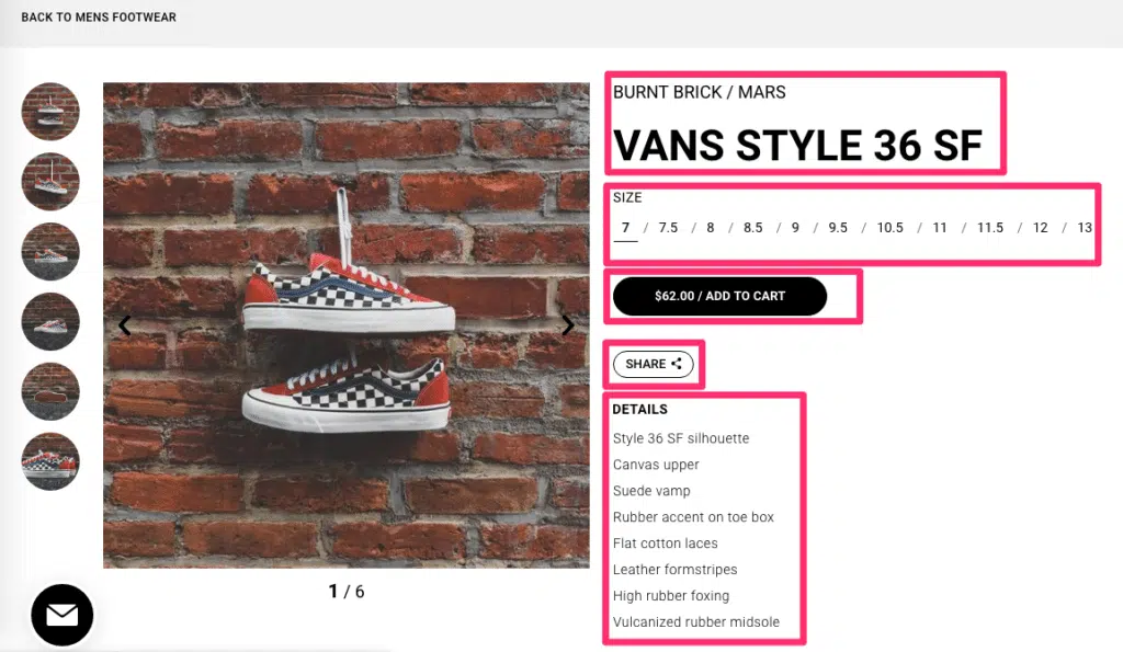
There’s less friction on Kith’s product page design because the information is easy to digest.
Since it’s less cognitively demanding, clicking “Add to Cart” feels like less of a commitment because your potential customers aren’t stressed out by the page’s design.
(Remember—reducing friction is one of your goals!)
Animations are feedback.
Shoppers always wonder:
Can I click this button? If I move here, does the image get bigger? If I have a question, can I expand this section to get my answer?
…but how do animations increase your revenue?
Simple. Feedback creates a seamless shopping experience.
In this chapter, you’ll learn how animations can improve your store’s experience…and how they can get you more customers, too.
Encourage Engagement with Animations
You might think of animations as design vanities. But animations can help you sell more.
For one, animations are feedback. Can you click this button? Did that item go to your cart? Did that link bring you to a new page, or did it just scroll you to a new section?
Check out this small animation from Evolution of Smooth (EOS):
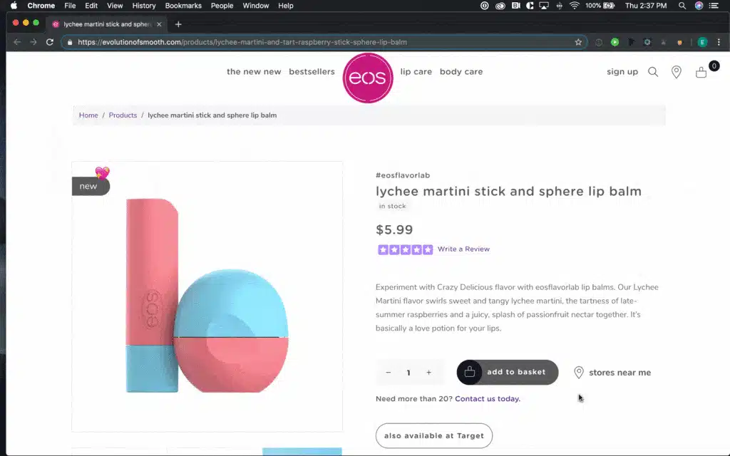
When a shopper sees the button changes color on hover, they understand they can click on it.
Feedback reduces uncertainty.
Acquire New Customers with Exit-Intent Popups
Popups—or lightboxes—are incredibly annoying.
They’re also unreasonably effective at converting visitors into leads (and shoppers into customers).
Zachary Prell strikes a good balance between an invasive lightbox and an attractive offer by only showing the popup when you try to leave their store:
Nonintrusive animations like this popup makes your online store more interesting.
In this example, Zachary Prell pitches a “private sale,” but you don’t have to do that.
You could tease a discount.
Or give access to exclusive content.
You could ask a question.
The key is that this popup is exit-intent.
That means it doesn’t disrupt the online shopping experience. It doesn’t appear until the shopper indicates they’re ready to walk out the door.
Reduce Overwhelm with Accordions
Accordions—those tabbed drop-downs that obscure or reveal text—keep the page uncluttered while allowing shoppers access to information they want.
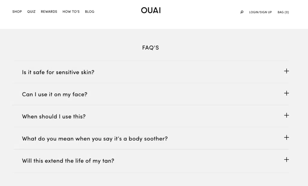
Ouai uses these for their product FAQ section.
And Boll & Branch uses them to provide extra product details:
If your text is getting too long (like Boll & Branch’s), accordions are a clean and intuitive way to give shoppers all the information they need without overwhelming them.
Your product page design should, obviously, sell your products.
But what about the people who are just browsing? What if they’re not ready to buy right now?
When they walk out of your store…they’re gone. Probably forever.
In this chapter, we’ll show you how to turn lost leads into future sales.
Trade a Party Favor for Email Addresses with Popups
We already showed you Zachary Prell’s exit-intent popup.
But that’s not the only kind of popup strategy.
In the same way you can offer someone a coupon when they enter your physical storefront, on-entry popups can kill two birds with one stone by offering a party favor and collecting their email address.
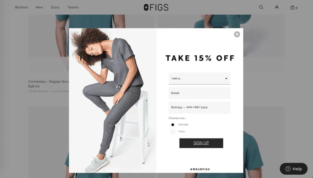
Figs offers 15% off if you sign up for their newsletter. (Although we do wish this person’s gender matched the gendered clothing behind it.)
We like the customization option: if a woman is shopping for herself, she’s not going to want emails about men’s clothing—to her, that’s spam.
This is the simplest approach..but offering a discount might cut into your profit margins.
Let’s look at another example.
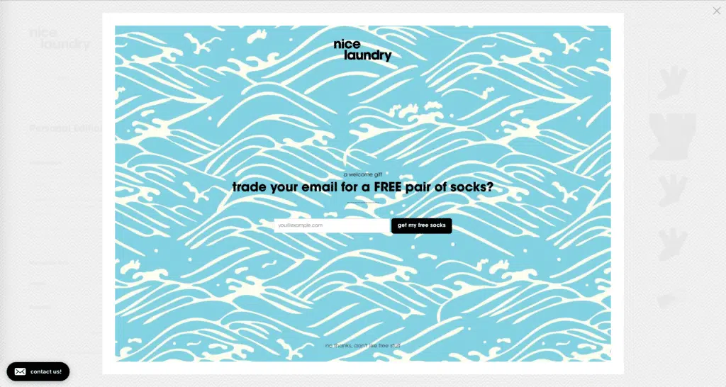
Nice Laundry offers a pair of free socks for your email address. This works for a couple reasons:
- It gives you an incentive to part with your email address.
- If you’re on Nice Laundry’s website, you’re probably looking for socks. Sending you a pair of free socks lets you try before you buy—and Nice Laundry bets you’ll like the experience and want to buy more.
(We don’t love the confirmshaming at the bottom. That’s not cool. It’s more than bad marketing or bad website design—it’s mean. You should never intentionally make people feel bad for not signing up for your newsletter or buying your products.)
Revolve has one of the best welcome pop-ups we’ve seen:
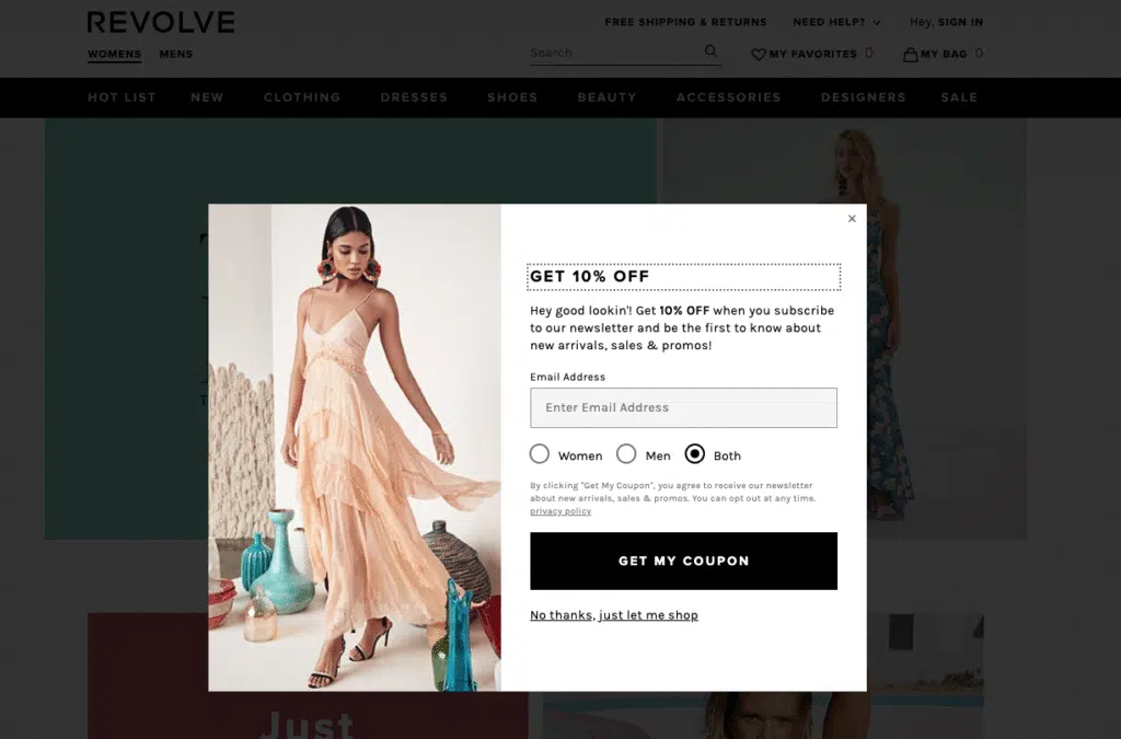
They highlighted the offer (10% off), gave you a compliment (“Hey good lookin’!”), give you the option to self-identify (although it would be nice if it was clearer exactly what your gender preference is going to be used for), and the CTA is super clear (“GET MY COUPON”).
More importantly, they handle rejection a lot better. A simple “No thanks, just let me shop” is all you need.
Seize the Out of Stock Opportunity
Most “Out of Stock” product page designs look like this:
Which is fine. It does the basic job of letting someone know that they can’t order the product they want right now.
But it also represents a missed opportunity.
How are you supposed to know when the item that interest you is back in stock?
ThirdLove gives you the option to receive an email notification once that product is still in stock.
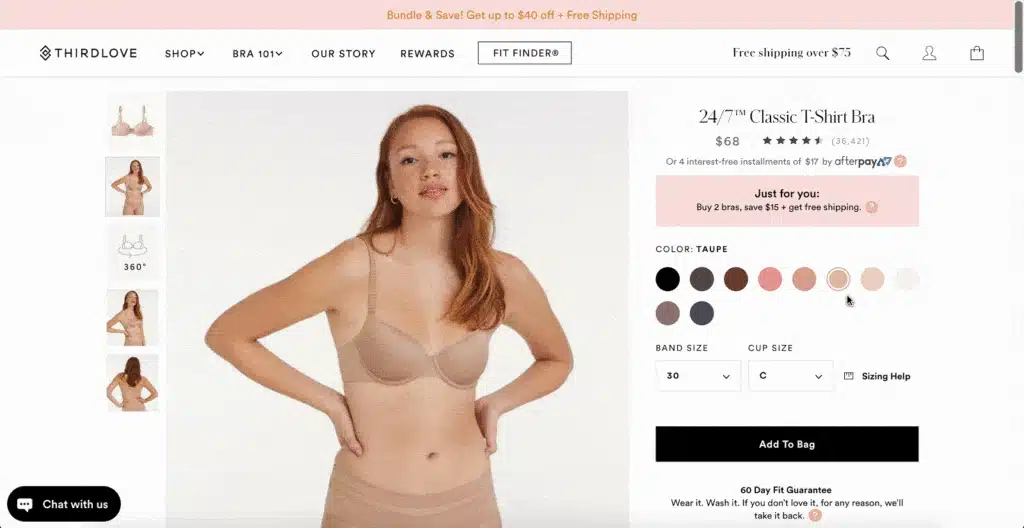
Not only is this a smarter strategy to drive sales: it also lets you begin to create a relationship with your new email subscriber.
That’s how to create a high-converting, beautiful product page design in 2022.
Now it’s your turn.
Which of these tips are you going to use? Was this product page design guide helpful? Did you implement any of the recommendations we made?
Let us know by leaving a comment below. And, if it is not converting well, it might be time to consider redesigning your website.
Product Page Design FAQ:
What is a product page on Amazon?
On Amazon, and every other ecommerce website, a product page offers an item sold on the website. This page offers crucial information about the product, includes images of the product, and may also showcase similar items.
What are the 4 types of products?
The 4 main types of consumer products are:
- Shopping goods (such as clothes and home decor)
- Convenience goods (such as food and hygiene products)
- Specialty goods (a unique product with a strong brand identity, such as an iPhone)
- Unsought goods (such as life insurance and fire extinguishers)
The type of product you’re selling should dictate what your website looks like. For example, SaaS website design should have compelling product pages and with a clear list of features the service offers.
When it comes to non-profit design, being financially transparent and having a streamlined donation page is integral.
How can you improve the conversion of a product page?
High-conversion methods vary depending on the goods you’re selling. Still, no matter what product or service you’re offering, you should always invest in high-quality website development, as a slow or cluttered page can deter potential customers from purchasing from you.
How do you create a product page in Wordpress?
You can create a product page in Wordpress by visiting ‘Products’ and going to ‘Add new page’. There, you will enter important product information such as the product title, description, price, and a few images of the product. Then, simply publish the page, and that’s it. If you want responsive WordPress website design that converts, Huemor will help you get there.
FREE ANALYSIS
Request Your FREE Website Analysis
Further Reading on High-Quality Website Design:
- WooCommerce vs Shopify: What’s the Best Ecommerce Platform for You?
- How to Create a Unique Category Page Design
- Tips for Optimizing Your Checkout Page Design
- How to Use Testimonials to Your Advantage
- Best About Us Page Examples
- Your Website Redesign Project Plan
- Foundational SEO for a New Website
- How to Optimize the Performance of Your WordPress Website
- Inbound Marketing Strategy Tips
- How to Use Dynamic Website Content on Your Site
Get Memorable Insights.
Sign up to receive actionable web design advice directly in your inbox monthly.
Get Memorable Insights.
Sign up to receive actionable web design advice directly in your inbox monthly.

Jeff Gapinski
President of Huemor
Jeff Gapinski is the President of Huemor where he helps plan the long-term strategic growth of the agency. Jeff is passionate about UI/UX, demand generation, and digital strategy.
What Do You Think?
Have feedback? Maybe some questions? Whatever it is, we'd love to hear from you.
Leave a Comment
![Website Design Standards We Follow [That You Should Too!]](https://huemordev.b-cdn.net/wp-content/uploads/2021/12/2023.04.04.Website-Design-Standards-We-Follow-That-You-Should-Too.jpg.webp)
No comments found